Services
- Brand Strategy
- Brand Story
- Graphic Design
About Klarody
Klarody is non-alcoholic adult cider created by husband and wife duo, Chris and Noelle. Chris and Noelle hail from Tacoma, Washington where they embody all things PNdub. As outdoor enthusiasts who loved to mix social drinking with all of their favorite adventures, they ran into a very common problem for millennials active in the social scene.
The problem–a slowing metabolism and an increasing responsibility to their health, work, and growing families. They found that many of their friends and peers were experiencing the same thing and were seeking a healthier and more balanced lifestyle. The fun and adventure could stay, but the buzz had to go.
Still, non-alcoholic alternatives that taste and look like real adult drinks are few and far between. Not wanting to sacrifice taste or health, they researched and formulated their own low-calorie adult hard cider alternative!
Now they needed the right brand to strategically position them in front of the right audience and set them apart from their competitors.
Fun fact: Does the word Klarody sound familiar to you? It probably sounds a lot like the English word, Clarity and that’s completely intentional. The root word, ‘Klar’’ in Klarody is Norwegian for Clarity.

The Story
Klarody was just getting started when they brought M Agency on to create their brand. The product was being formulated in their warehouse but they had a plan for distributing and marketing. They just needed a strong introduction to their audience with clean, simple designs and punchy messaging.
Since Klarody’s goals were to distribute their products via farmers markets, retailers including grocery stores, and bars local to Washington state, we needed to better understand the non-alcoholic drinks market, their audience, and their competition.
The Strategy
Part 1: The Market
We looked into the non-alcoholic adult drinks market to understand trends that could reveal helpful insights.
For Klarody, we found that they would be first movers in the non-alcoholic hard cider alternative category here in the US. While this was exciting, it was also a risk because there was no proof of concept that this type of product could be viable.
Part 2: The Audience
Next, and arguably the most important, was the audience research. We scoured through reviews, testimonials, forums, and study group interviews to identify the target audience and what motivated them. We learned about the audience’s cares, expectations and desires, and most telling, what troubles keep them up at night.
For Klarody, we found that the rise in wellness culture and sober curious movement has created a high demand for more quality, adult alcohol-free alternatives.
Part 3: The Competition
We performed a competitive analysis to uncover their biggest competitors, what they do well and where their weaknesses lay.
For Klarody, we found that they had no direct competition in their location or niche.
Research completed, we used the insights to inform the remaining part of our strategy phase: positioning. Our copywriter, senior designer, and branding designer collaborated to build out Klarody’s “why,” or purpose statement, brand characteristics, audience personas, audience motivators, positioning statement, and visual direction.
After presenting our findings and strategy to Chris and Noelle, they felt confident with where our direction was heading and approved. Score!
The Guidebook
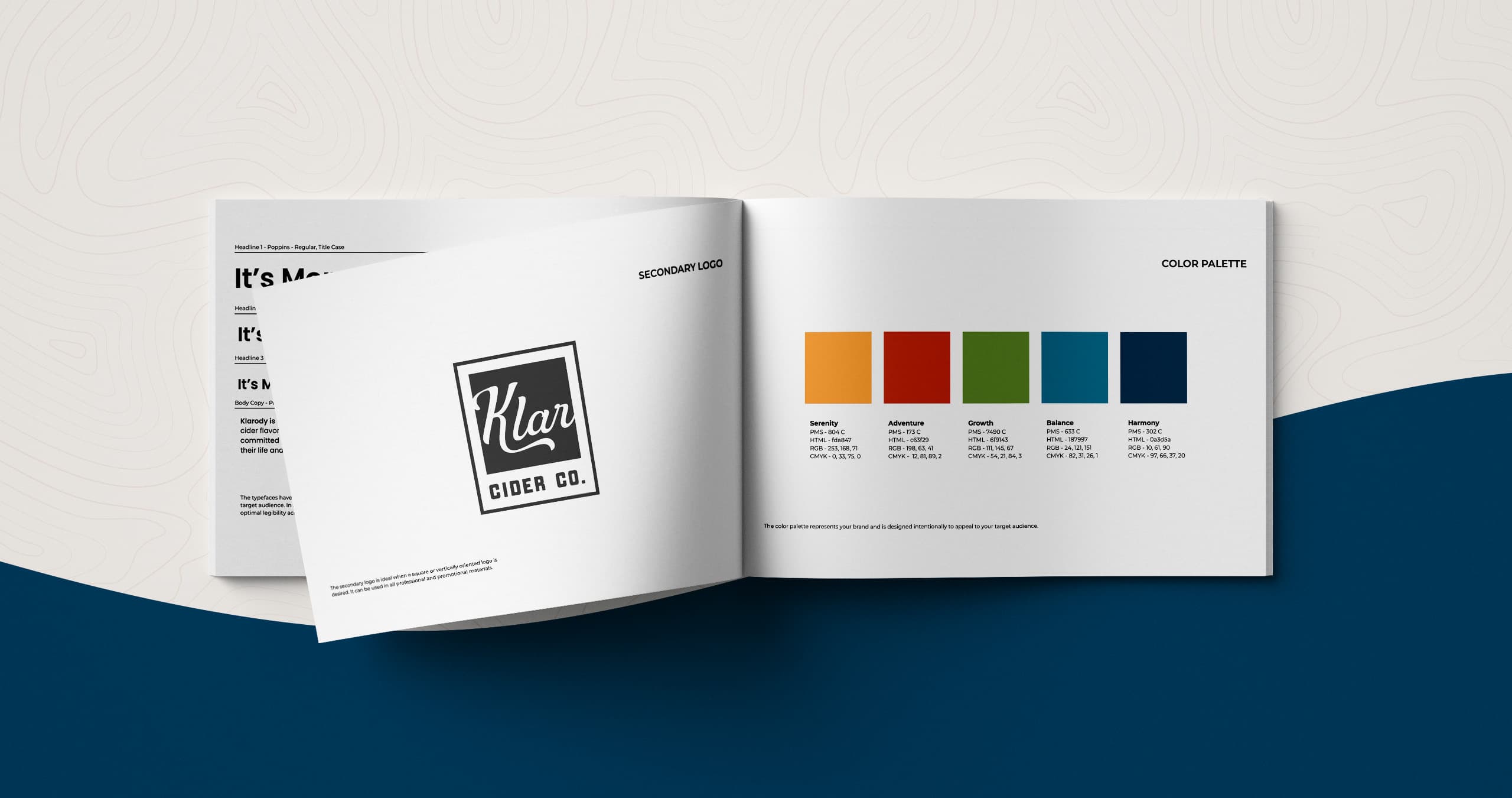
Next, we went into creating Klarody’s style guidebook. Here, we took the foundation laid by the strategy to build the brand layer by layer. Our guidebook is a comprehensive document housing all of the brand’s design, print, written and hybrid elements including the tagline, StoryBrand Brandscript, typography, logo, imagery, photography and visual applications. This acts as a central source for businesses to reference to keep everything consistent and cohesive.
Our team of creatives once again collaborated to bring the best and most relevant ideas to life while keeping the client’s vision at the forefront.
Messaging
Klarody wanted to change the conversation around consuming alcohol from, “why aren’t you drinking?” to “what are you drinking?” Part of their mission is to normalize NOT drinking in settings where it’s expected. So they’re not just providing a healthy alternative, but trying to change the way people associate with alcohol and help them build a more balanced, healthier relationship with it. With this in mind, we started working on messaging and storytelling that summed up what their brand stood for: clarity in mind, balance in lifestyle.
From there we developed Klarody’s brand voice, tone, and personality. As in, what would Klarody sound and be like if they were a person? With Klarody having bold and uncompromising characteristics, it felt natural they would be daring, speak in an encouraging tone, and tell relatable stories.
After the voice and personality were defined, we developed the story. M Agency is a StoryBrand certified agency, which means we use the StoryBrand framework to build an effective, engaging, and impactful story.
The story has to center the hero, Klarody’s customers, and their journey. Based on our research, this audience was either on the journey to a healthier lifestyle or already sober, but didn’t want to miss out on life or be shamed because of their choice to abstain.
With this in mind, we wrote messaging that best aligned with addressing the audience’s wants, challenges, and needs.
Since all of our team is StoryBrand trained, we can bring the most effective elements of storytelling forward through messaging and design.
Visuals
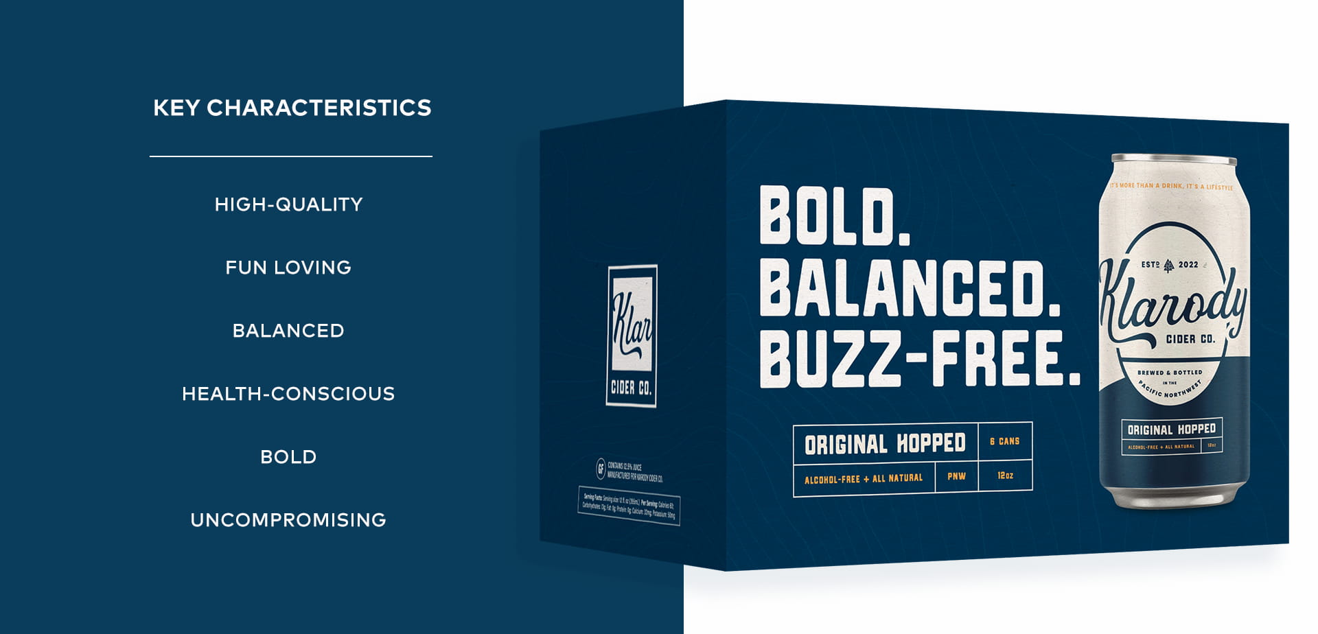
Chris and Noelle wanted Klarody to look like it had been around a long time. Not quite vintage or traditional, but nostalgic of beer and soda cans fifty to sixty years ago. Clean and simple, but with some old school vibes.
Our visual strategy was about unifying Klarody’s audience towards a shared identity and values. We also kept in mind that the product is brewed and bottled in the PNW which inspired much of our visual direction.
Logo
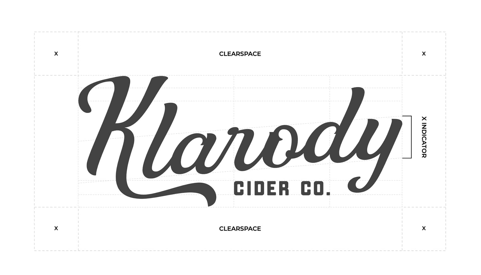
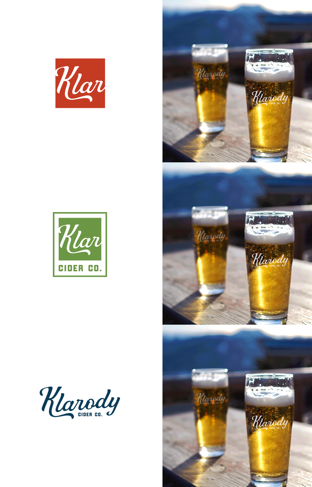
We sought inspiration from brands who successfully merged classic aesthetics with simplistic elements. We even looked into different Norse symbols representing clarity and balance (a nod to Klarody’s roots) and some PNW identifiers. Our designers and creative director eventually landed on a logo with a simple, yet timeless typeface.
Fonts
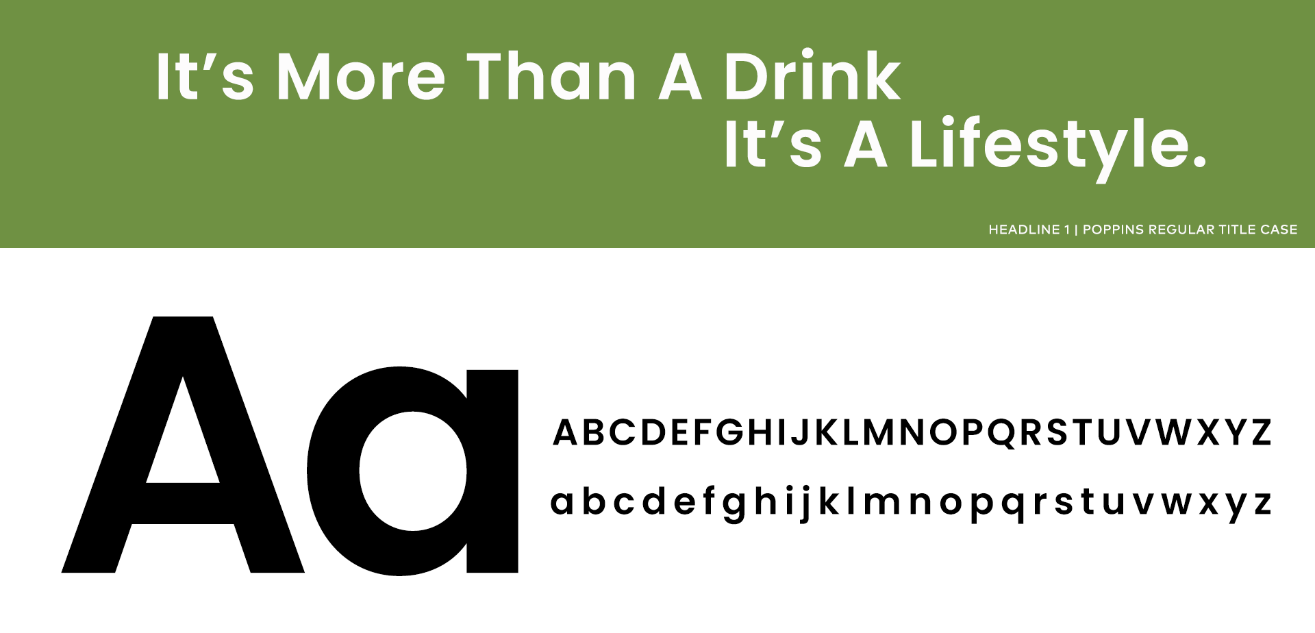
We went with the Poppins font for its boldness and ability to work well with both modern and traditional designs.
Color Scheme
We wanted a colorful palette that was representative of Klarody’s inclusive and welcoming nature. These key brand colors appear in the logo and throughout all brand materials, including Klarody’s packaging, so we wanted to have a mix of eye-catching and bold colors to compliment their collateral. We also thought it would work well for their packaging when they began introducing more flavors into the market.

Additional Patterns
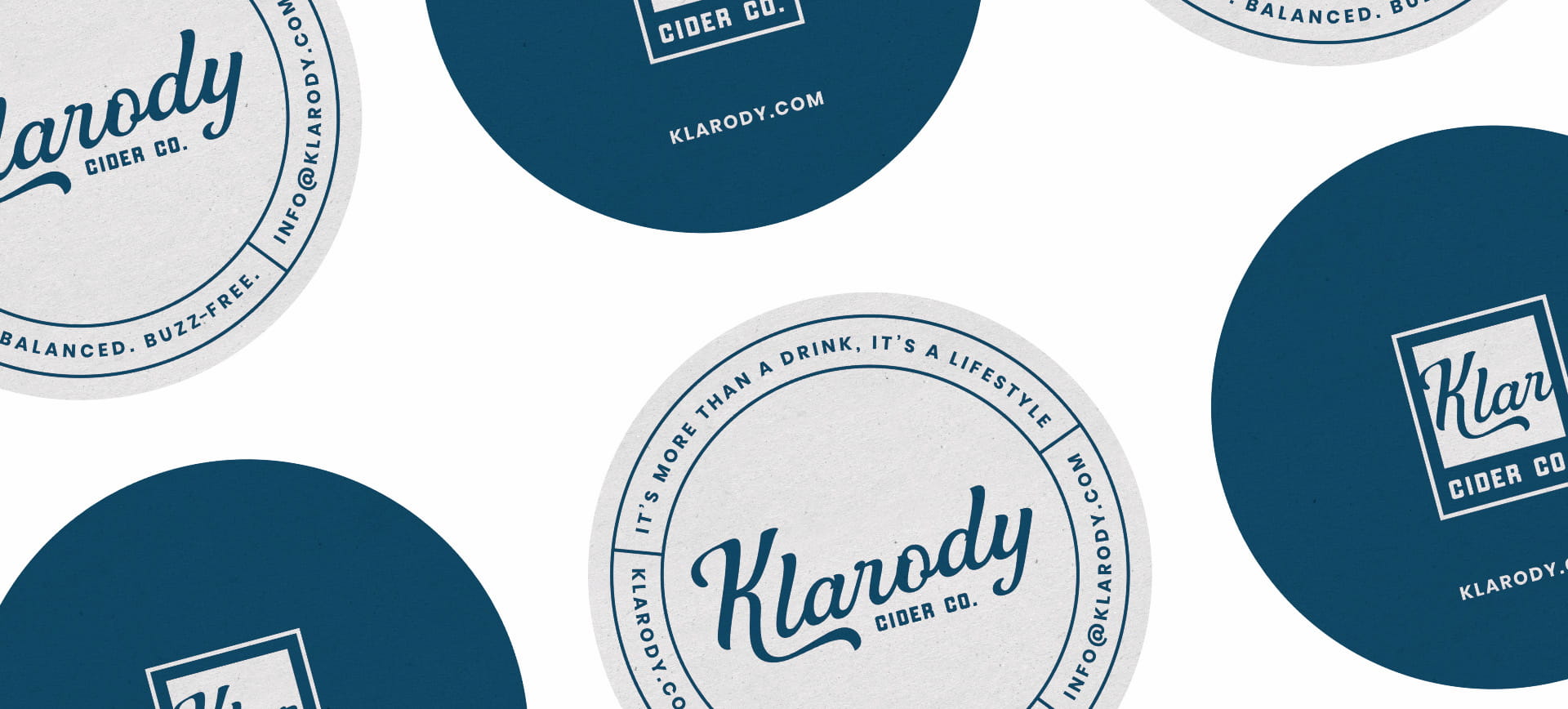
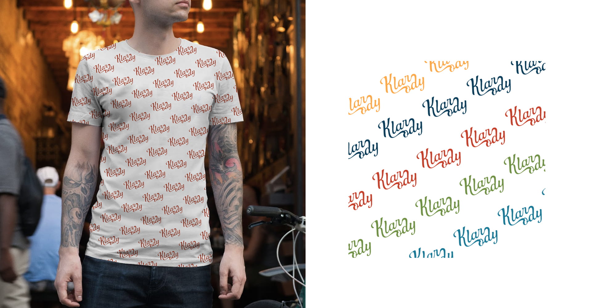
Our designer created a beautiful pattern of the logo that can be used for stationary, packaging, website backgrounds, as well as other print and digital designs. These patterns help create brand identity, recognition, and visual interest.
Imagery + Photography
Klarody’s people are adventure-seeking, fun-loving, PNW-enthusiasts! The imagery we selected had to reflect their love for adventure and resonate with their identity tied to all things Washington and the West coast: mountains, evergreen trees, rainy days, sweaters, fires on a beach, and beautiful sunsets.
The photography brings in warmth, while making the audience feel a sense of familiarity. As though they’ve been on that exact hike before or went to meet up with friends at that exact bar. The images are intended to bring real moments in real places to life.

Packaging
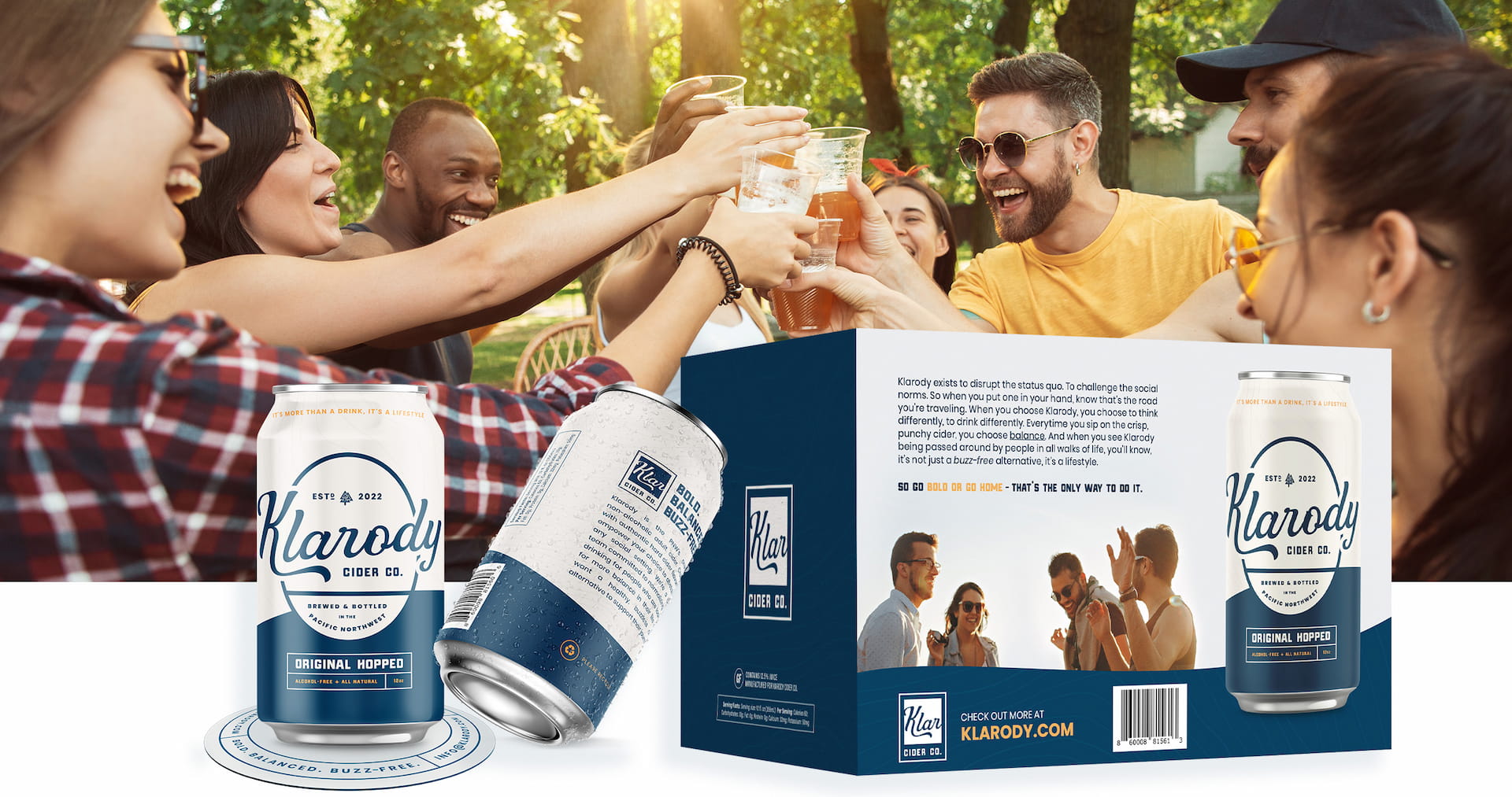
With all of the branding elements flushed out, they needed a design for their cans and box packages. One of the main goals was to make it look and feel like a timeless product. Our designer was inspired by classic beer can badge designs, colors and layouts, but also wanted to infuse modern touches to make the can design stand out and look fresh.
Designer nugget: The small tree symbol at the top of the can is an icon our designer made as a nod to Klarody’s Norwegian roots. The icon is a cross between a symbol from Norse mythology and trees to showcase both the Nordic and PNW roots.
