
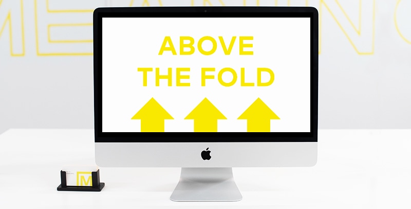
What Does “Above the Fold” Mean?
When something in the browser window is immediately visible to a user who lands on a web page it is considered above the fold. Anything that is not immediately visible, and would require scrolling to become visible, is considered below the fold.
For example, when a user lands on your homepage they’re likely to see something like a menu, a banner, a headline and a call to action (CTA). All of those would be above the fold content.
The Origin of Above the Fold
The idea of “the fold” comes to us from the earliest days of publishing. Back when printed newspapers were at their peak, the top editors and designers for each paper would work out the best stories to feature on the front page. Knowing they needed to capture attention from passersby at a newsstand, the teams worked to incorporate multiple pieces of content like articles, headlines, photographs, infographics, etc.
However, each paper’s front page was then folded in half before being sold so a greater priority came to the layout and call outs above the fold, with supporting content or articles being pushed lower below the fold.
As publishers moved to more digital formats, the fundamental design ideas moved as well, as they were already familiar with optimizing the top half of the front page. More importantly, they understood the importance of capturing attention immediately.
The rest of the world took note.

Above the Fold Is Dead?
There is a lot of debate in design communities as to whether this concept has any merit at this point in website design and web development. To understand why, we need to back up a bit.
In the 90s and early 2000s, companies were advised to put all their content above the fold, and at the time it made complete sense. People were very used to older computer programs that showed everything on one single screen. Scrolling was often clumsy, and it wasn’t nearly as intuitive for a majority of users. At the time the screen resolutions and average pixels were much more consistent as well.
Fast forward a bit and we see the birth of the smartphone. As brands rethink user experiences for these tiny screen sizes on mobile devices, we see more and more people get comfortable with the concept of scrolling. As more people get used to content being below the fold we see higher scrolling usage on traditional website experiences that are done on standard desktops and laptops.
This paves the way for social media sites to introduce the idea of feeds, where users are trained to scroll endlessly.
At this point, it is safe to say a majority of people know scrolling tends to lead to more content.
With that, let’s circle back.
Why Is the Fold Important for Webpages?
If we know people will scroll then why is the fold still an important concept? The idea of “the fold” is still crucial for marketers and web designers who have to weigh optimization with content marketing. When website visitors land on a web page we know that first interaction with any content is prime to get a few pieces of information across. We want to make sure we convey where users are, and what the company offers. We also want to include a CTA that resonates with our target audience. This first interaction is critical, and it all happens above the fold.
It makes little difference what we’re designing – the first touchpoint matters. Whether we’re designing a landing page for a real estate agent, or thinking through a cohesive eCommerce experience, we know conversion rates and bounce rates will be determined by what we prioritize.

We’ll be going into more detail about how we think through above the fold design in a future post. If you’d like to learn more about things like responsive design, usability, search engine optimization or our favorite WordPress plugins then sign up below to get added to our future emails.