Services
- Brand Strategy
- Copywriting
- Photography
- Website Design
- Website Development
Overview
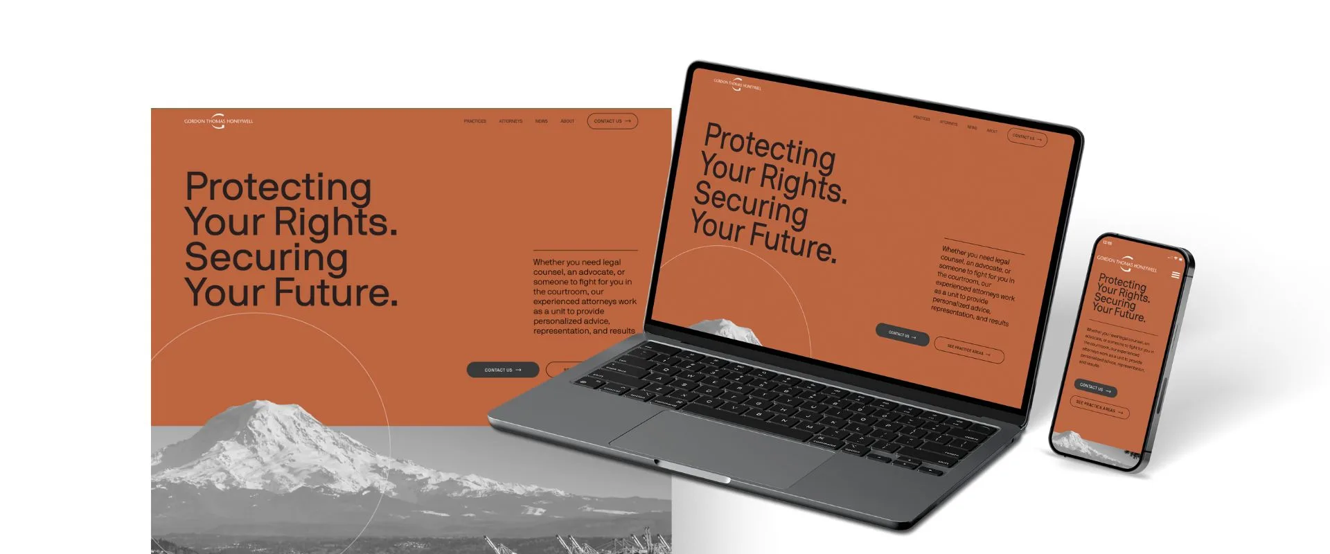
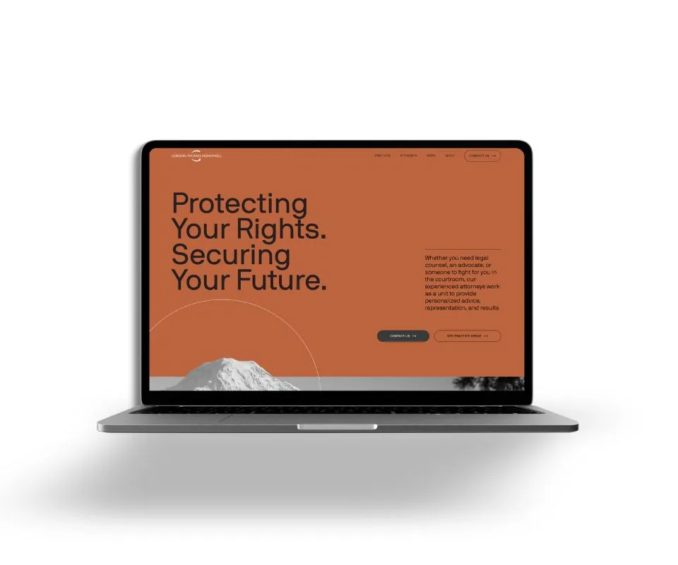
Gordon Thomas Honeywell is one of the Pacific Northwest’s most respected law firms, with a 100+ year legacy and a reputation built on results. But their digital presence no longer reflected the strength of their brand, the depth of their expertise, or the accessibility clients needed—especially those navigating legal crises.
That’s where we came in.
M Agency helped GTH create a new digital identity, voice, and user experience while honoring their deep roots. From brand strategy to photography, to a full website overhaul, this was a transformation built to make GTH feel as confident online as they are in the courtroom.
Strategy
We began with an intensive brand and web strategy phase, uncovering the core values, user behaviors, and digital roadblocks in GTH’s existing site. Through interviews, audits, and stakeholder workshops, we clarified two essential goals:
- Help clients in moments of stress find clarity and trust fast
- Reflect the firm’s professionalism without sacrificing approachability
We recommended a modular, user-first site experience; more emotionally resonant messaging; a lighter visual system; and an editorial voice that felt reassuring, not robotic.
We also restructured the sitemap and optimized page layouts to match how clients think, by needs, not practice areas.
Brand Strategy
Our brand strategy centered on helping GTH own a dual identity:
- A storied legacy law firm with deep experience
- A forward-thinking, client-centered team built for today’s legal landscape
We worked with the GTH team to distill their values, audience needs, and tone into a refreshed brand style guide balancing professionalism, trust, and empathy across every touchpoint.
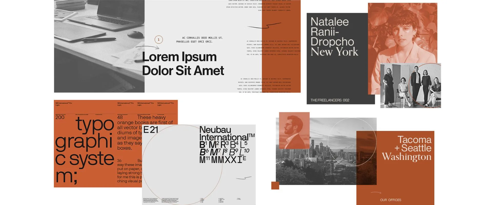
Design Style
Our brand design team knew they needed to reflect the firm’s legacy, credibility, and contemporary mindset. Our design strategy found the balance between timeless and timely.
The Approach:
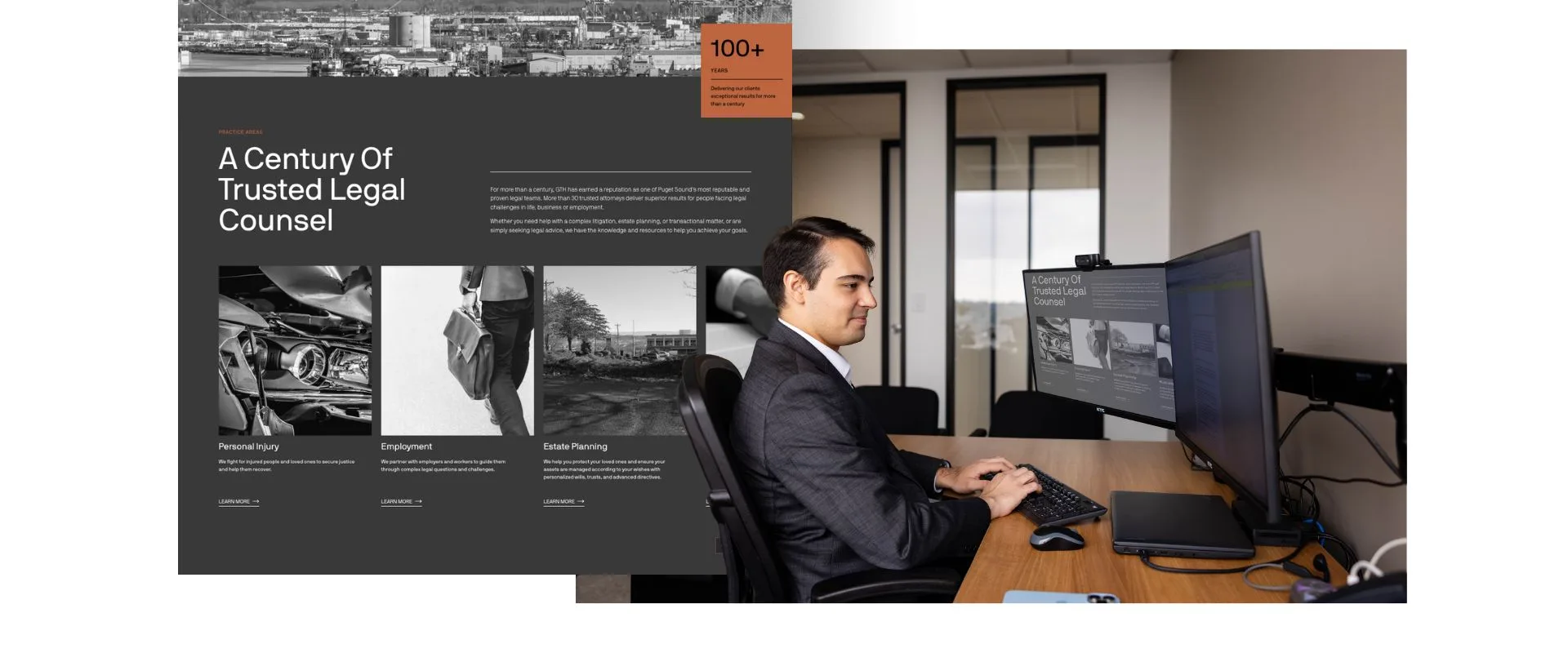
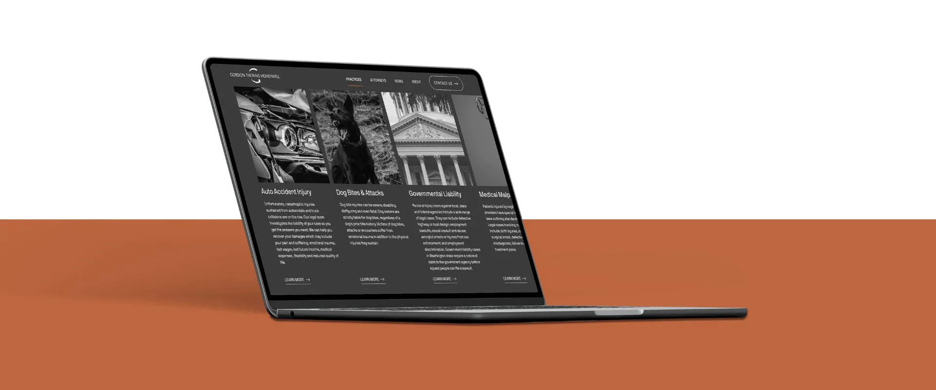
- Photography style blends duotone and black-and-white imagery, layered with subtle overlays
- A pop of sepia adds warmth and humanizes the space, complementing the earth tones and textures present in GTH’s physical offices
- Ample white space and modular sections create a modern, digestible user experience
Typography + Color:
- Serif and sans-serif font pairings reinforce a blend of tradition and modern professionalism
- Color palette centers around warm neutrals and organic tones, communicating approachability and stability
Our Moodboard
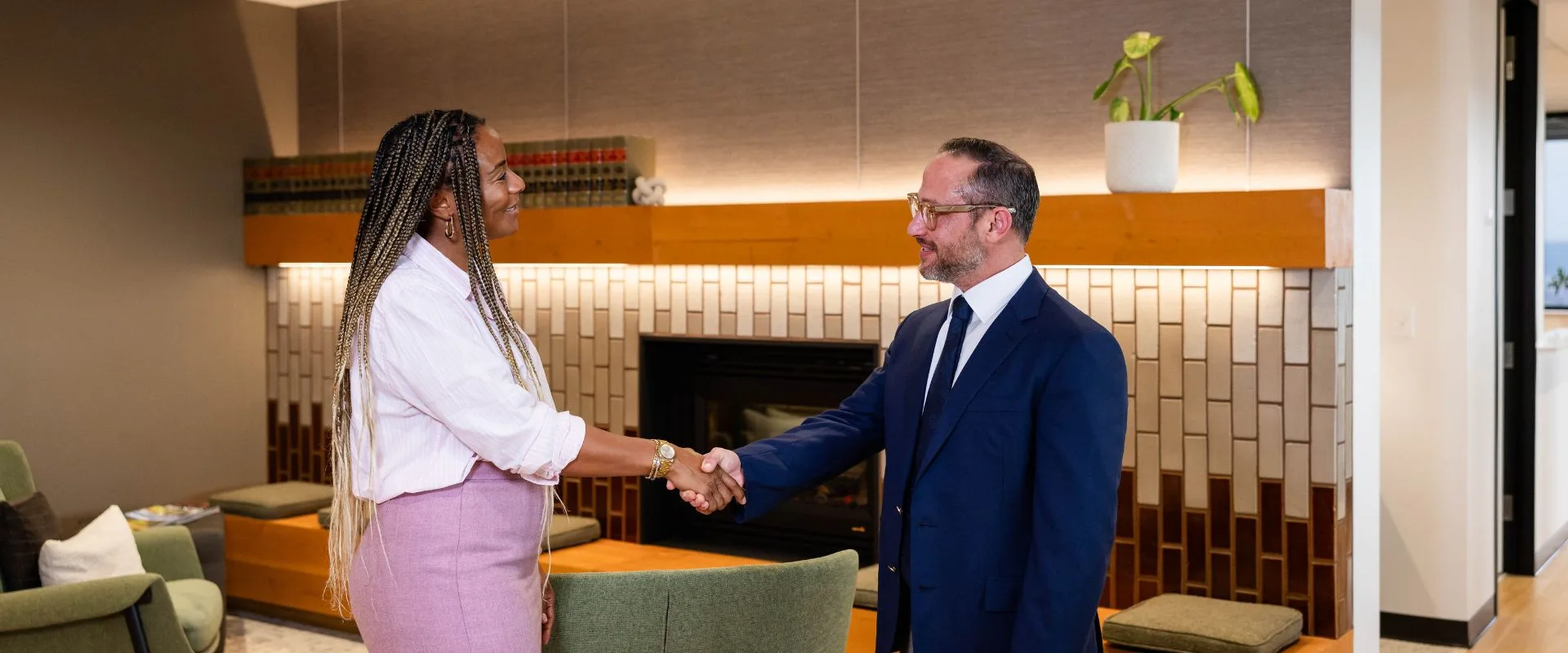
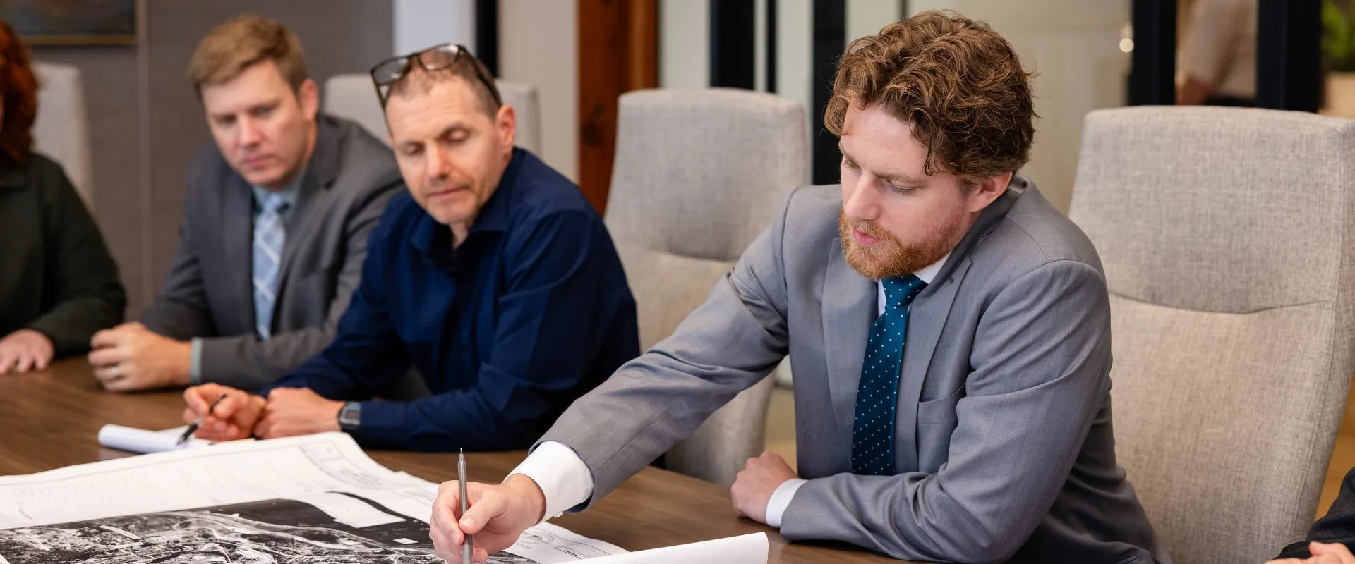
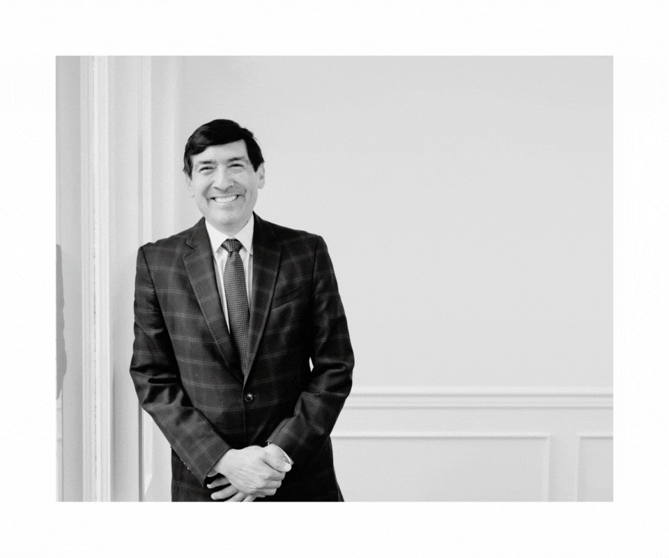
Photography
Natural lighting, warm tones, and real attorney interactions. Our shoot showcased GTH’s people and environment, professional but never stiff. The photos humanize the brand and reflect the trust clients place in them every day.

UX/UI + User Journey
Designing for Users in Distress
Many site visitors would arrive in a heightened emotional state—injured, grieving, navigating a lawsuit, or needing urgent guidance. The site needed to feel reassuring, focused, and easy to navigate. That meant:
- Clear headlines and calming visual hierarchy
- Digestible content organized in short sections and plain language
- Visible—but never aggressive—calls to action, respecting the user’s mindset
- Warm, real photography that humanized the attorneys and added approachability
Rethinking Navigation Around Real Problems
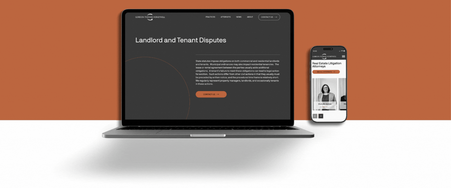
We restructured the navigation and page flows to be client-first, not firm-first. Traditional law sites often lead with internal structures like practice areas or alphabetical attorney lists. Instead, we reframed services around user needs and real-world scenarios (e.g., “Injured?” instead of “Personal Injury Law”).
This small shift made a major difference in usability.
Making Dense Content Feel Light
You don’t win trust by dumping 2,000 words on someone. You win it by helping them find exactly what they need, fast. Law firm sites tend to be content-heavy, and for good reason. But that depth shouldn’t translate into overwhelm. We introduced:
- Modular content blocks
- Expandable accordions for detailed legal explanations
- Page intros that summarize key points
- Whitespace and scannable visual rhythm to make reading easier
Content Strategy
GTH is nearly a full-service law firm, with distinct teams in business law, real estate and land use, trusts and estates, personal injury, employment law, and more. Each area serves a different client audience, each with different expectations, tone sensitivities, and decision-making timelines.
All this to say, we had to solve a tricky messaging puzzle:
How do you communicate breadth without sounding generic and depth without overwhelming the user?
To address this complexity, we brought in a legal-specialized copywriter with over a decade of law firm writing experience. She partnered with our in-house SEO and brand copywriters to shape content that balanced:
- Authority and accessibility
- SEO performance and brand voice
- Firm-wide consistency and practice-area specificity
Content at Scale
We developed over a dozen high-performing content pages, including:
- A homepage that unified GTH’s brand, values, and breadth of services
- SEO-optimized practice area pages, customized for both Tacoma and Seattle locations to improve regional visibility and search performance
- A robust contact structure and CTAs to turn readers into leads
GTH came to M with strong word-of-mouth in high-value practices like trusts & estates and business law, but they lacked the organic search presence to support growth in more competitive areas, like personal injury.
Our copy and SEO strategy helped shift that.
Web Development
The GTH site is rich with graphics, layered visuals, and dense content, but it still needed to load quickly and perform smoothly for every user. One of the more technically complex elements was the use of parallaxed imagery throughout the site.
Parallax scrolling looks simple, but requires real nuance to get right, especially on mobile.
We used the lightweight library simpleParallax.js to handle animation functionality while maintaining performance. Then we rigorously tested screen scaling and responsiveness, ensuring consistent experience across browsers, breakpoints, and device types.
Accessibility + Mobile Responsiveness
Clarity and contrast were essential, especially with background images layered behind key copy. We solved potential readability challenges with dark gradient overlays that dynamically ensure text remains accessible even on vision-impaired devices.
We also enabled font smoothing (aliasing) to soften text edges, making headlines and body copy easier on the eye. And to ensure a strong mobile experience, we developed the site using TailwindCSS, a mobile-first framework that ensures designs gracefully adapt from phones to widescreens.
Empowering the Client
No one wants to launch a beautiful site they’re afraid to touch. That’s why we:
- Streamlined the WordPress backend by hiding unused menus and turning off irrelevant features
- Enabled a visual editor experience so GTH’s internal team can preview edits live as they make them
- Automated image optimization, removing the need for manual compression or cropping
Need a Brand That Builds Trust and Drives Action?
Whether you’re a law firm, financial advisor, or any business where trust is everything, your website, messaging, and brand experience should reflect the caliber of your work. We help professional service providers modernize without losing what makes them great.