Completed
- Brand Strategy
- Visual Identity
- Brand Story
- Graphic Design
- Photography
The Client
Neptune Seafood, Chelsea Farms, and The Oyster Bar are three channels of a family-owned business that was established in 1987. Chelsea Farms produces the seafood, The Oyster Bar serves the seafood and Neptune Seafood distributes it to commercial entities and consumers. This dynamic trio of businesses is family-owned and locally-run with Neptune Seafood being a globally recognized seafood distributor.
Their shellfish farming legacy extends two generations when both mother and father farmed, harvested, ate, and sold geoduck on the shore right in front of their home. That shore is called Chelsea Farms and it’s rich legacy continues to spread across the world, from providing their restaurant Chelsea Farms Oyster Bar its famous Chelsea Gems to sharing sustainably farmed shellfish through Neptune to homes near and far.
The Problem
In the grand ocean of branding, Neptune Seafood, Chelsea Farms and Chelsea Farms Oyster Bar, faced a challenge of perception. A gap existed between the brands, hindering the seamless storytelling they aimed to share. The question loomed: How could these brands harmoniously unite while each still claimed their unique spotlight? The puzzle pieces were in place, but the picture was incomplete.
The Goal
Neptune Seafood’s goal was clear – weave a cohesive tale that spans the journey from farm to table.They sought a narrative that bound the family’s three distinct brands – the farm, the restaurant, and the distributor. A clear story across all three brands was the coveted treasure.
The Solution
Neptune Seafood’s goal was clear – weave a cohesive tale that spans the journey from farm to table.They sought a narrative that bound the family’s three distinct brands – the farm, the restaurant, and the distributor. A clear story across all three brands was the coveted treasure.
Brand Strategy
Branding is more than just a logo – it’s the entire narrative behind the brand. Our mission is to take your brand’s essence and weave it into a strategic framework that stands out in the crowd and resonates with your customers. When Neptune Seafood, Chelsea Farms, and Chelsea Farms Oyster Bar came aboard, our challenge was clear: how do we create a coherent strategy that tells their combined story while maintaining their individual essence?
Immersion and Collaboration
We kick-started the strategy with immersive meetings and thorough research. By delving deep into their business and engaging with key stakeholders, we unearth the gems that set them apart. Our initial interviews allow us to better understand who Neptune Seafood, Chelsea Farms and Chelsea Farms Oyster Bar are at their core.
To map out a unique positioning, we audited existing assets, researched audiences, scrutinized analytics, and dived into the market.
Navigating the Research Waters
Research isn’t just data collection – it’s the art of understanding your market, audience, and competition. We dove into the depths of desk research to identify trends, analyze competitors’ strengths, and create detailed audience personas. These personas guide us through customer motivations, desires, expectations, and pain points. The personas told their own stories for each brand.
Our research revealed distinct audience dynamics – Neptune Seafood’s international reach versus Chelsea Farms Oyster Bar’s local presence within Washington state.
But our research didn’t stop there.
To truly understand how each brand seas food differently, some of our local team members visited Chelsea Farms, Chelsea Farms Oyster Bar and Neptune Seafood themselves. We walked their shores at peak geoduck diving hours, experienced their meticulous farming to distributing processes, witnessed firsthand the dedication they pour into their restaurant and tasted the richness of their Chelsea Gem oysters.
Unveiling a Unified Identity
As the pieces of the puzzle fell into place, a unified picture emerged. We discovered the intrinsic connection between Neptune Seafood and its sister brands – a family legacy and the guardianship of the tide’s treasures through sustainable practices. We saw Neptune Seafood’s story as a tale of two generations nurturing a profound love for the sea, extending from Olympia to international markets.
Putting it All Together
With a profound understanding of the brands and their audiences, our compass led us to the “sweet spot.” This alignment between customers’ motivators and brand characteristics is where connection, service, and satisfaction thrive.
Color Scheme
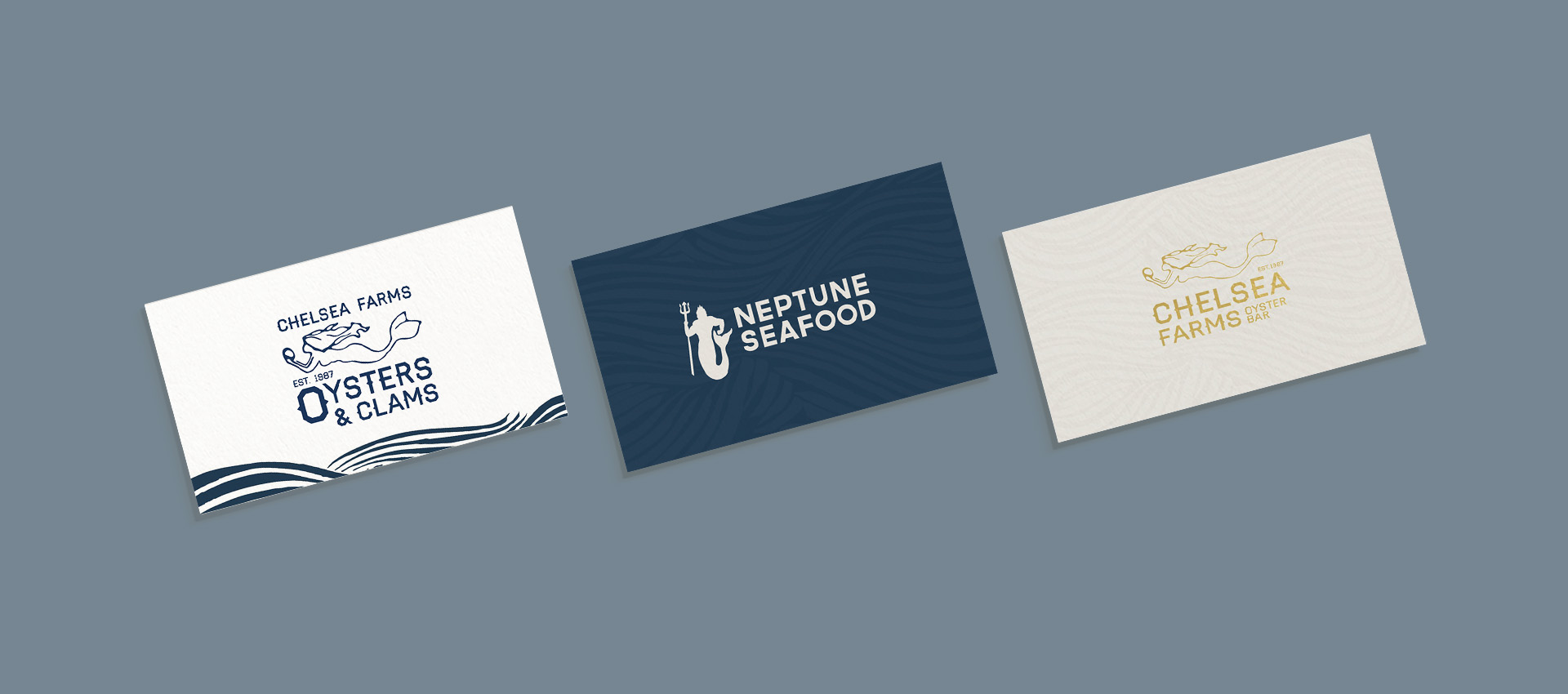
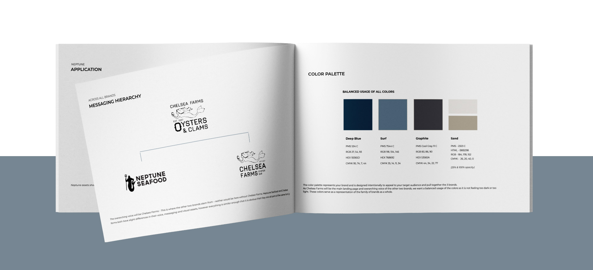
All three brands embrace a unified palette, yet each has its own standout color. It’s like a family resemblance with individual quirks.
Chelsea Farms Oyster Bar: Beachy Elegance
This lighter tone gives the brand a breezy, refined beachy vibe. Deeper shades and hints of gold add a touch of luxury. And, of course, Graphite is there for clear and consistent text.
The assets of Chelsea Farms Oyster Bar exude a sense of bright sophistication. Think beachside elegance, with navy and patterns adding subtle accents.
Neptune Seafood: Deep and Bold
Neptune Seafood’s palette also stems from the overarching Chelsea Farms palette family but with a twist. Deep Blue takes the lead, creating a deep and mysterious vibe. Lighter shades play a supporting role, letting the Deep Blue shine. Graphite gets a job as text on light backgrounds for easy reading.
Neptune Seafood’s palette captures the deep, enigmatic allure of the ocean. Deep Blue sets the stage so the treasures can really shine.
Unified Colors, Unique Stories
The shared palette unites these brands, yet the colors help each brand tell its own tale. From Chelsea Farms Oyster Bar’s elegant warmth to Neptune Seafood’s deep mystery, each hue has a story to tell.
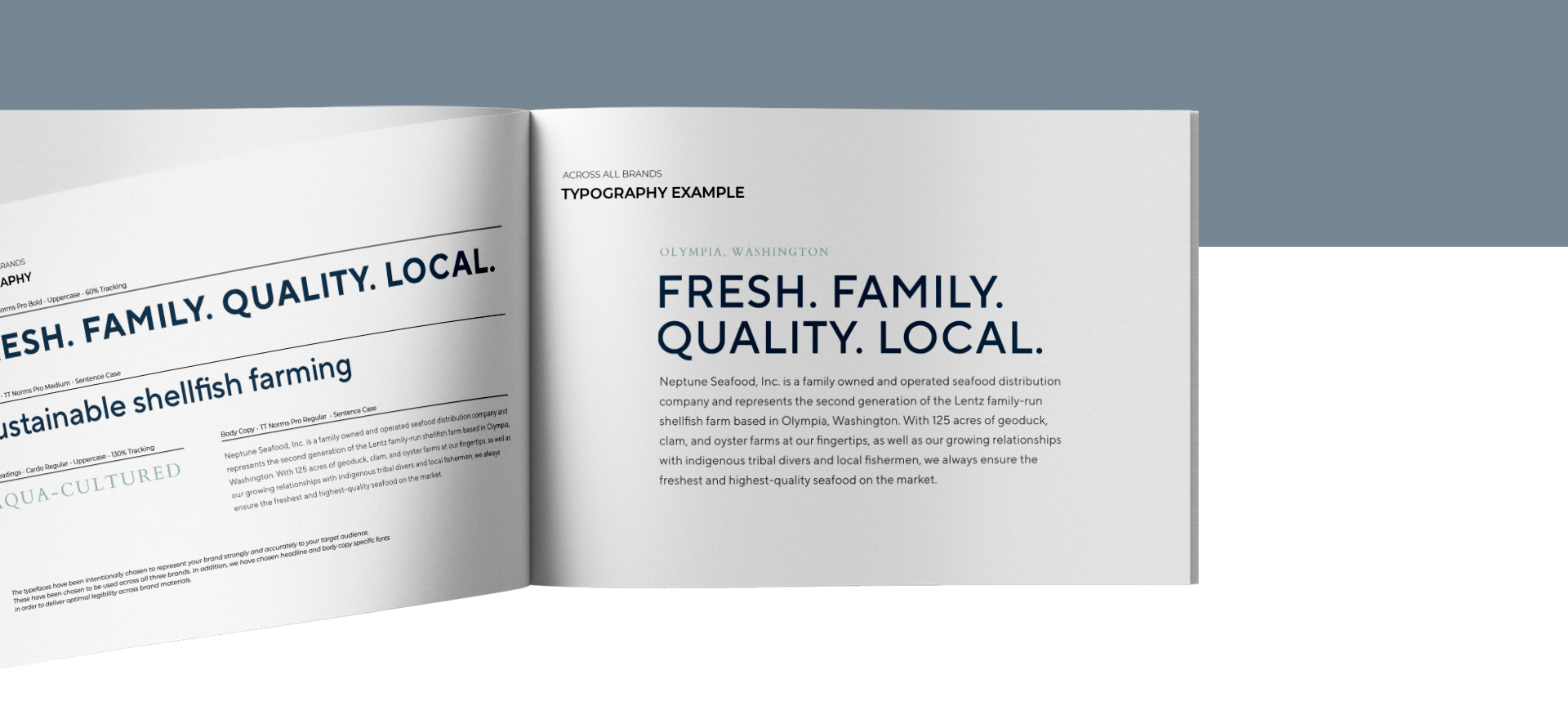
Fonts
For consistency, the same fonts are used across the brands. The typefaces have been intentionally chosen to represent their brand strongly and accurately to their target audiences.
Patterns
Drawing inspiration from the fluid lines and harmonious aesthetics of Chinese print art, we sculpted a wavy pattern that captures the essence of the sea’s gentle movement. Our lead designer sought inspiration from Chinese art because many of Neptune Seafood’s international clientele are located in China. This pattern becomes a tapestry that intertwines with the brand narrative, echoing the stories of Neptune Seafood, Chelsea Farms, and Chelsea Farms Oyster Bar.
This intricate pattern isn’t just a design element; it’s a visual narrative that can take on two distinct roles. As a background, it flows gracefully across the canvas, enveloping designs with a sense of depth and movement. From the back of menus to envelope linings, its fluidity adds a touch of sophistication.

Photography
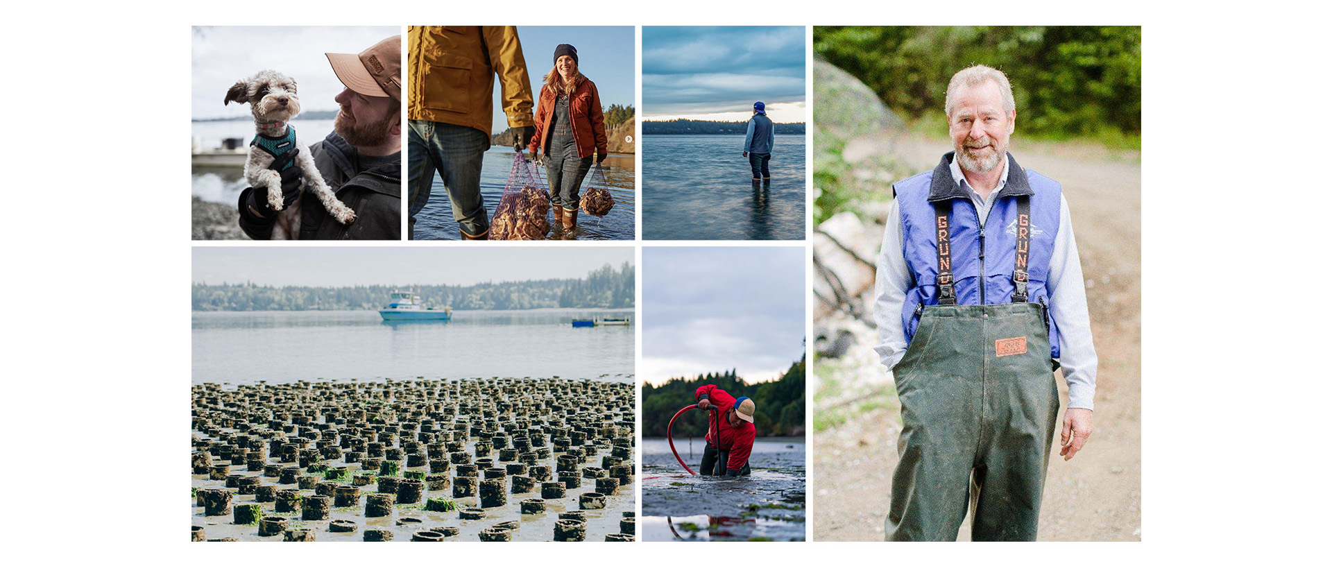
Chelsea Farms: A Glimpse into Heritage
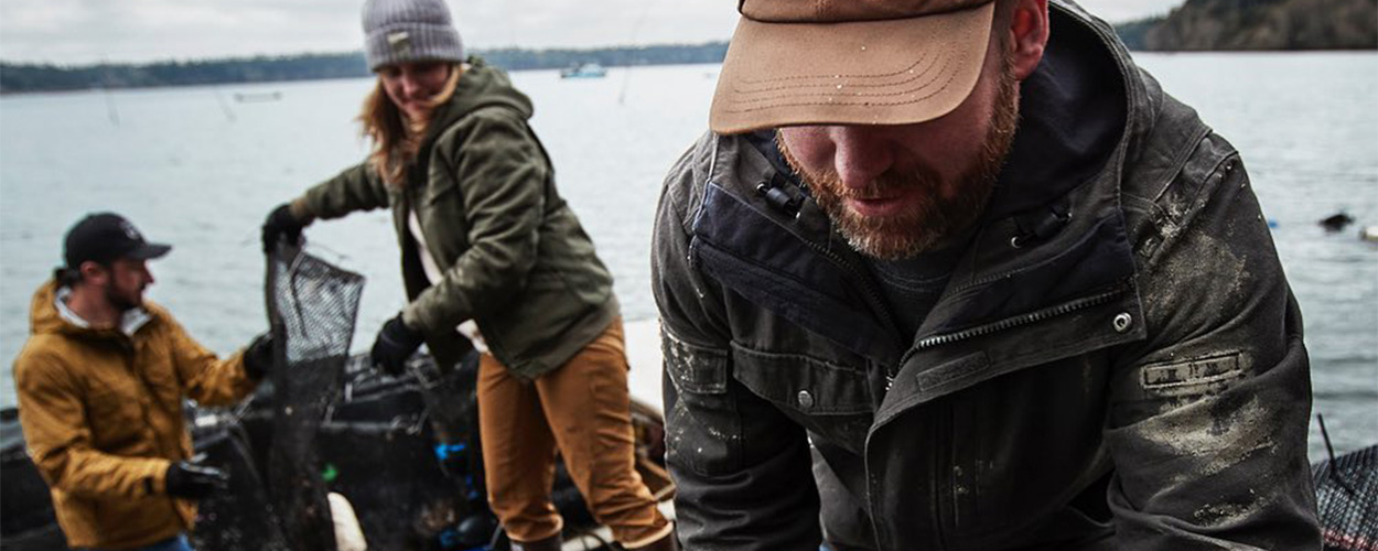
Photography for Chelsea Farms is a window into its rich heritage. We showcase the farm, its processes, and the legacy it upholds. Each image is a crisp portrayal, capturing the authenticity and dedication that runs through the farm’s veins. With no filters or overlays, we let the images speak for themselves, revealing the heart of Chelsea Farms.
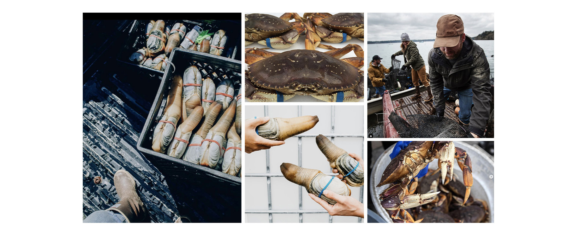
Neptune Seafood: A Focus on Delicacies
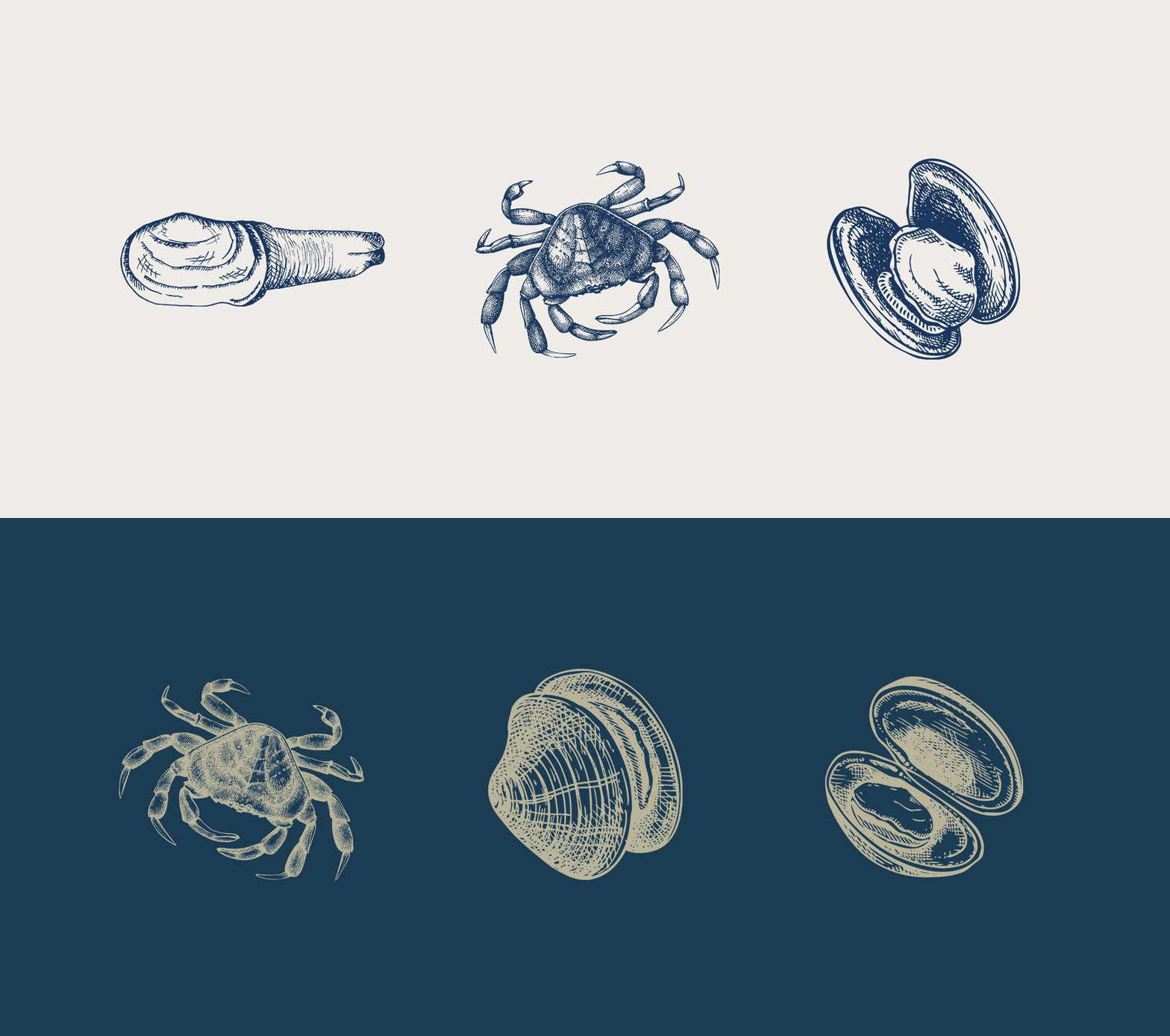
When it comes to Neptune Seafood, our photography lens zooms in on the delicacies themselves – geoduck, crab, and more. Each image is a showcase of the pristine quality and allure of the products. With sharp clarity and no distractions, the images allow customers to indulge in the visual delights that Neptune Seafood offers.
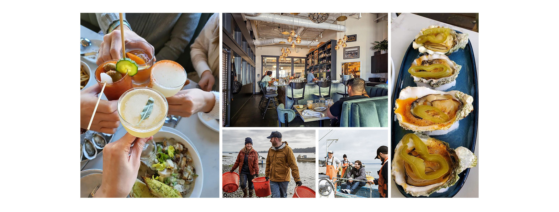
Chelsea Farms Oyster Bar: A Feast for the Senses
Photography for Chelsea Farms Oyster Bar is an invitation to feast not just on food, but on an experience. We curate images that tantalize taste buds, capturing the ambiance and offerings of the oyster bar. Alongside this culinary journey, we sprinkle in images that hark back to the farm, completing the circle of the brand’s narrative.
Conclusion
Through smart strategy, vibrant colors, resonant messaging, engaging patterns, and captivating photography, we have brought Neptune Seafood, Chelsea Farms, and Chelsea Farms Oyster Bar’s unified story to life. Just as their journey from farm to table unfolds, our tailored approach has beautifully merged their family legacy, shellfish offerings, and commitment to sustainability.
From defining their brand strategy to curating their visual identity, we’ve ensured that their story resonates with customers, stands out in the market, and unites their brands seamlessly. The culmination of our work echoes their goals of sharing a cohesive narrative, captivating audiences, and standing strong as a family of brands.
Get in Touch and Craft Your Brand’s Tale
Want your brand story to resonate? Reach out. Let M Agency help you weave a narrative that sticks, speaks, and inspires.
