Services
- Brand Strategy
- Graphic Design
- Copywriting
- Website Design
- Website Development
Overview
Grit City Vet started with a simple question:
How can basic surgical care be given to pets at a price that’s accessible for their families?
In a region facing long veterinary waitlists, rising costs, and families forced to choose between their pets and their budgets, Grit City Vet emerged to fill the gap.
The founder, Dr. Corey Michel, needed a brand that would reflect clinical trust, collaboration, and community heart. So we rolled up our sleeves and got to work.
Strategy
We started with market, audience, and competitor research to uncover what pet owners were struggling with, what referring clinics were missing, and where Grit City Vet could shine as a true solution. Then we built a brand to back it up.
Our findings:
- Pricing was a massive barrier. Many families could not afford even basic services.
- Pet owners lost trust in care as large corporations bought up independent practices.
- Referring vets had nowhere reliable to send cases that weren’t hospital-grade but were still urgent.
- We positioned Grit City Vet as a missing link: a surgeon you could text, trust, and afford.


Building The Brand.
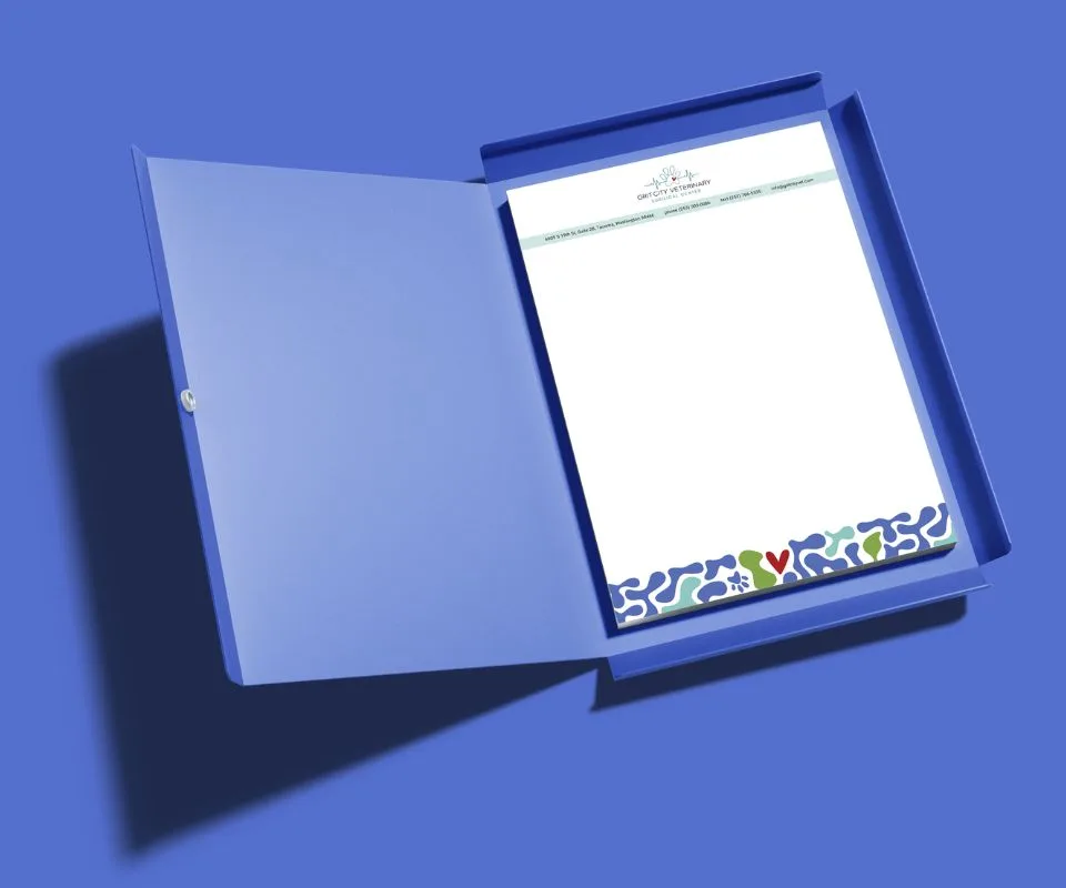
The goal for this brand was to stand apart from sterile, overly clinical veterinary offices. The overall direction was to build a space that feels warm, modern, and welcoming, reflecting Corey’s vision for a clinic that offers expert surgical care without the coldness that often accompanies medical environments. Throughout the process, we centered his desire for a practice that is high-quality, transparent, approachable, and deeply connected to the community.
Logo
Corey came with a clear vision of a continuous line drawing that integrated a cat silhouette, a dog silhouette, and an EKG line. We were mindful that including all of those elements could make the logo feel overly busy, so in an effort to represent both dogs and cats in a simplified way, we introduced a pawprint to replace the two silhouettes. This allowed us to honor his idea while creating a cleaner, more versatile mark.
Typography
The typography uses Roboto, a clean sans-serif font chosen to strike the balance between professional and approachable. Sans-serif fonts naturally signal modernity and clarity, which aligns well with the clinic’s values around transparency and ease of communication. Its legibility supports the practical needs of a surgical clinic, such as instructions, discharge information, and educational content, ensuring the visual style never gets in the way of critical messaging.
Colors
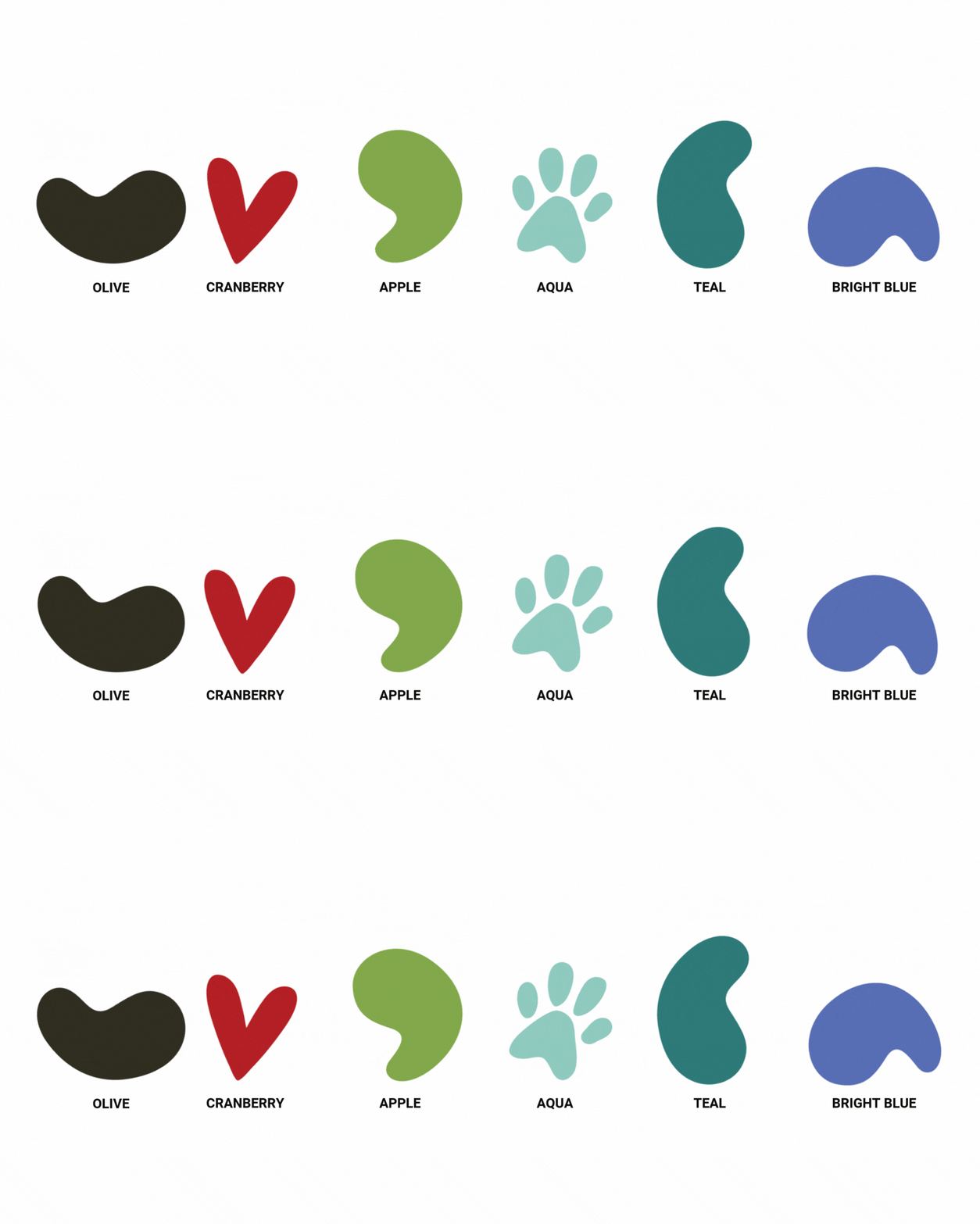
The color palette was built from Corey’s desire to avoid typical clinic colors and instead embrace richer, deeper tones. Teal and Aqua bring a calming, trustworthy feel that still nods to medical environments without being sterile. Apple and Olive add warmth and earthiness, while Cranberry brings emotional warmth and subtly reflects Corey’s favorite color, red. Bright Blue adds a sense of playfulness and modernity. Together, these colors communicate joy, care, and dependability while maintaining a palette that feels fresh rather than overly clinical.
Pattern
The pattern design incorporates bones, leashes, hearts, and by special request, a hidden paw print “Easter egg.” The intention was to create something fun, light, and on-brand without overwhelming the core messaging. This pattern serves as a flexible visual asset that can be used across murals, collateral, packaging, and the website, adding personality and cohesion without distracting from key information.
Corey’s reaction to the pattern gave us so much joy! He said, “It’s unique. It’s different. It’s fun!”
Photography
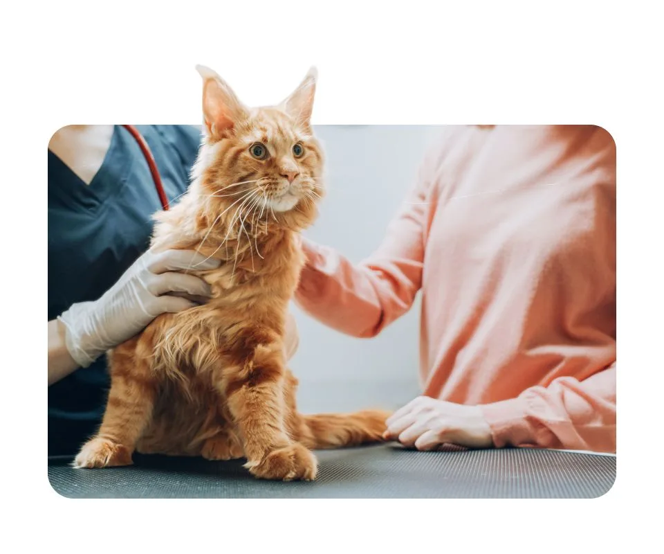
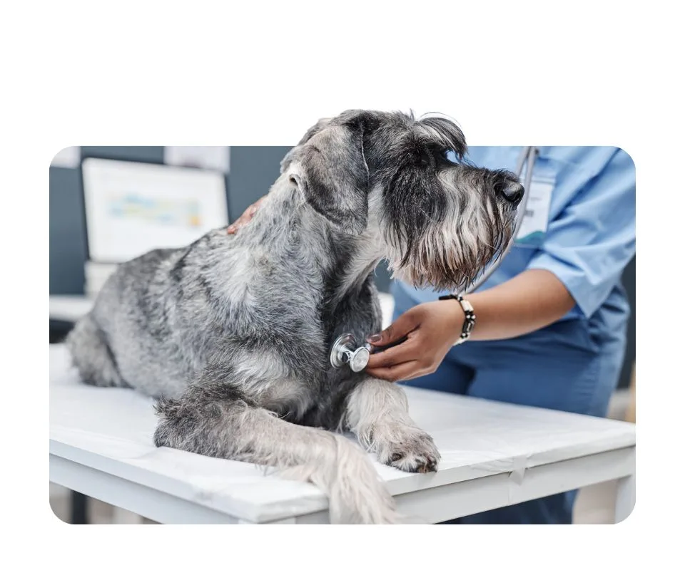
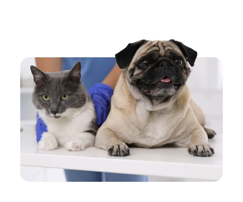
Photography focuses on animals with a human element without focusing too much on faces, paired with images taken in veterinary spaces and background-removed pet photography.
This direction reinforces the idea that GCV is pet-first while still honoring the meaningful relationships between humans and their animals. It also supports the brand’s messaging around care and empathy without compromise.

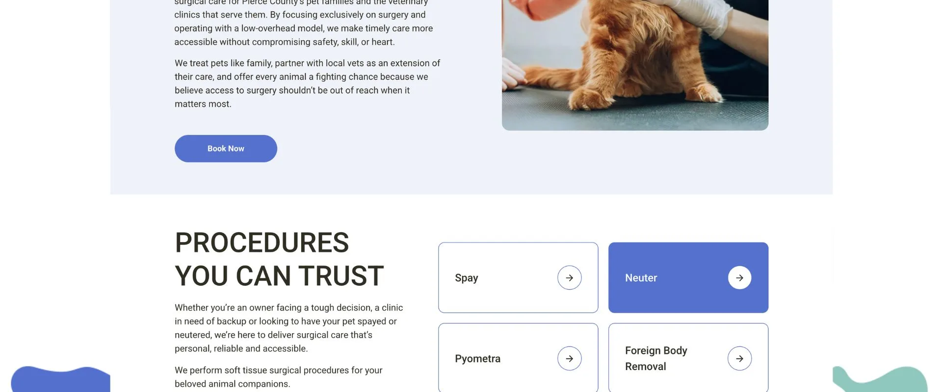
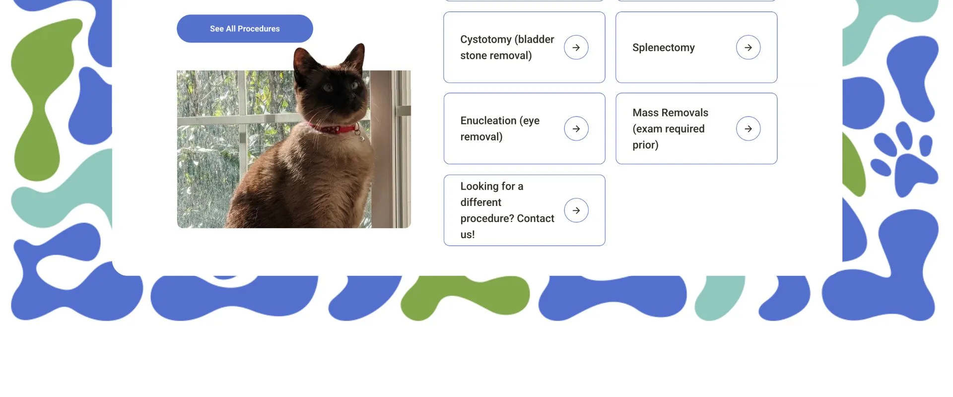
The Website: Built to Book (or Refer)
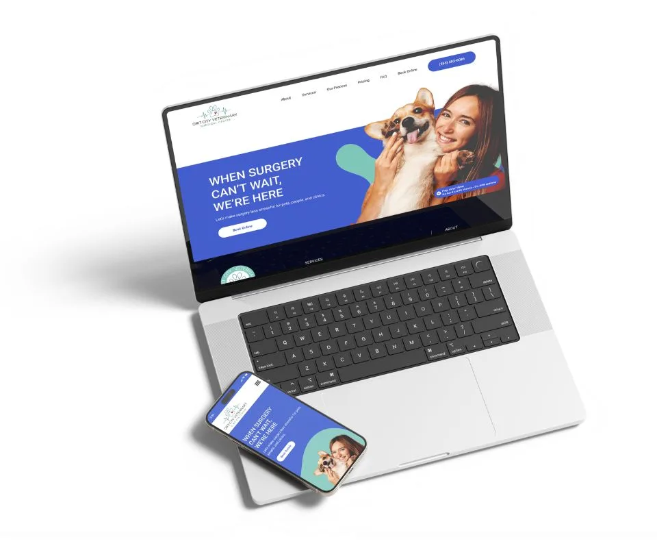
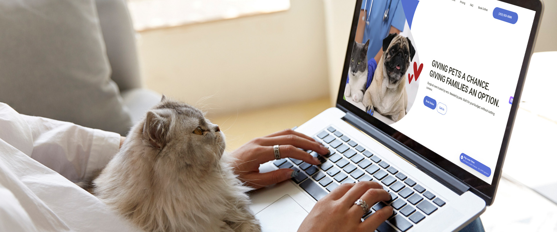
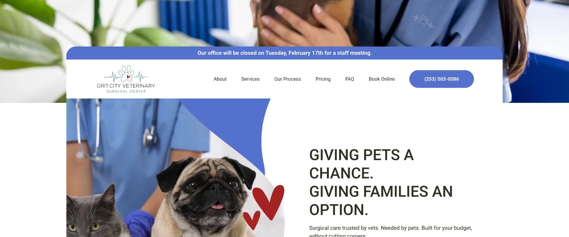
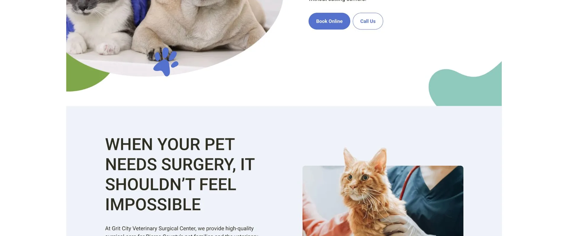
With the brand ready to go, the site was ready to reflect Grit City Vet’s unique story and service.
The biggest hurdle here was making sure the design matched the owner’s feelings towards pet care. It should be welcoming and loving. Not something to fear.
Beyond that, we wanted to make information clear and easy to find.
We laid out an easy-to-find/easy-to-understand process for:
- Pet owners who need affordable/accessible surgery fast
- Vets and clinics looking for a trusted surgical partner
We added:
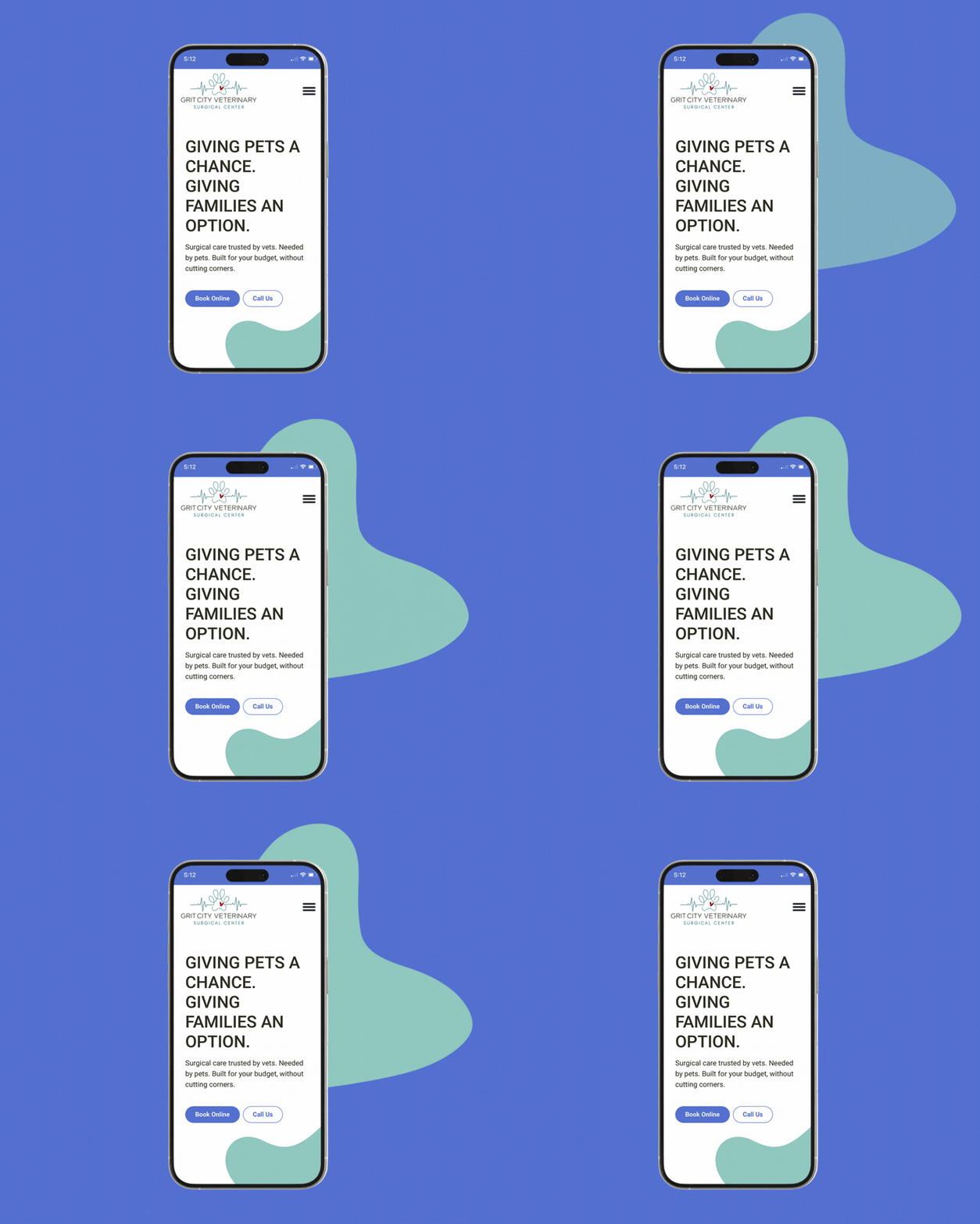
- Split CTAs for easy booking vs. consults
- A sticky nav bar to keep the next step in reach
- Warm, welcoming language that demystifies surgery
- A highly skimmable layout for busy vet partners
- Easy-to-follow funnels for learning about procedures that ultimately lead to scheduling


Client Testimonial
“Fantastic group to work with! All of our products came out amazingly well. Highly recommend!”