Services
- Graphic Design
- Copywriting
- Videography
- Website Design
- Website Development
- Marketing Campaign
The Client
Weddermann Architecture is a highly respected woman-owned architecture firm that has contributed to the Tacoma community in many ways. Our client was moving into a new space and needed elevated branding to bring the building to life.
But first, could we nail their logo?
The Problem
For years, Weddermann had been searching for a logo that accurately represented their vision and brand to no avail. After many attempts with nothing coming close to their standards, they came to M Agency bearing two requests: a timeless yet relevant logo and a brand refresh to match.
The pressure was on, but we love a good challenge.
The Goal
Weddermann Architecture needed a brand that told the story of their work in a way that highlighted their dedication to service and the unique talents of each person on the team.
Our goal was to create a modern, unique brand that evoked a feeling of community and built authority and trust with their current and prospective clients.
The Solution
Strategy, a bit of fairy magic from our designers, and a well-crafted story created a recognizable and timeless brand that reflected their prolific reputation. The logo? Nailed it.
Brand Strategy
After completing audience, market, and competition research, we found that Weddermann Architecture’s target audience struggled with justifying the cost of the investment if the work did not live up to their expectations. They wanted to work with a firm that partnered with them to see their vision through, was trustworthy, transparent, and had excellent communication skills.
Using information from our comprehensive research stage, we began building out the brand characteristics and audience personas.
We focused on positioning Weddermann Architecture as a firm that understands building is often the most significant investment a person or company will make. Their brand characteristics spoke towards being excellent communicators and real people who use their skills to help others. We wanted their positioning statement to say:
This is the type of brand that prioritizes their clients’ goals over their egos—which is unique for a design firm of their caliber.
For the visual direction, our designers thought the best way for their brand to visually stand out, especially as a woman-owned business, was to use bright lifestyle imagery to create an emotional connection between the brand and their audience. We included wood and stone to bring in warmth and comfort while still keeping it modern and relevant with clean designs and intentional pops of red.
After rounds of collaborative sessions between the designers, writers, and strategists, we finalized the brand strategy and presented it to Jennifer, owner and lead architect of Weddermann Architecture, and her team.
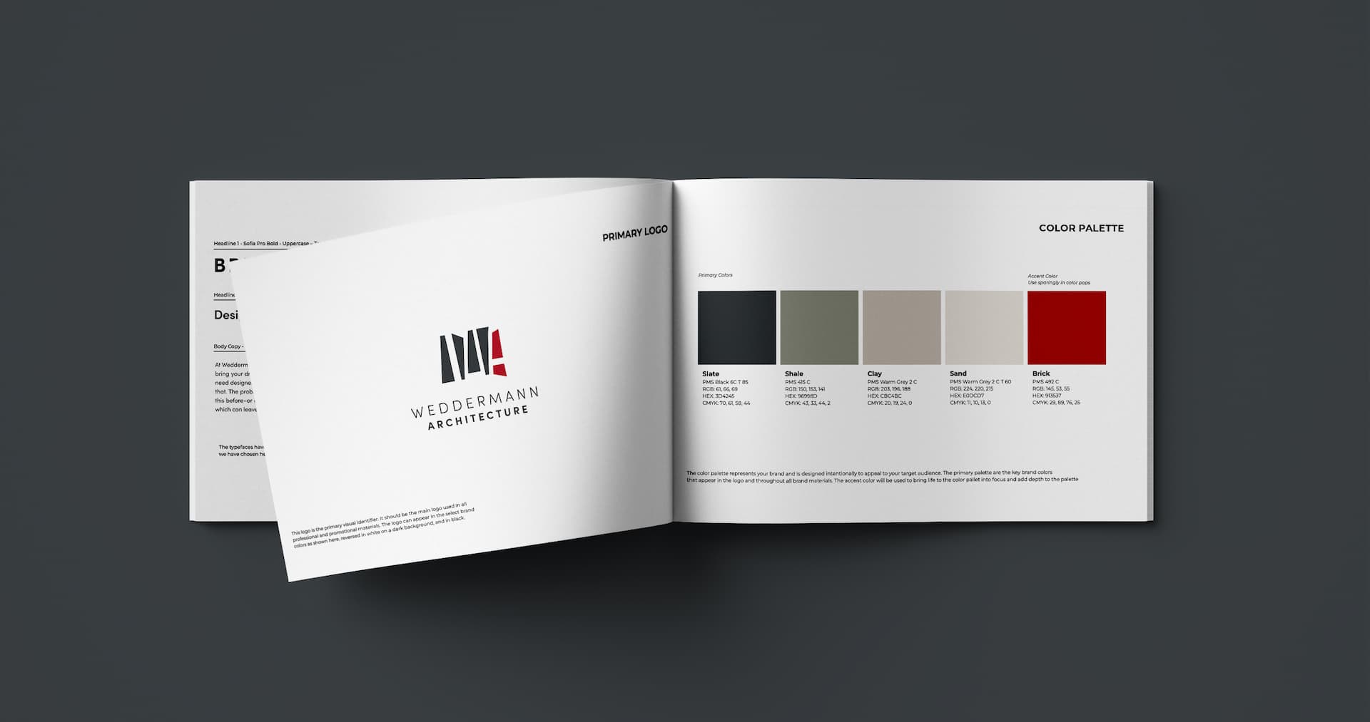
Brand Guidebook
The Weddermann team approved the brand strategy, so we moved on to our next phase: the guidebook.
In this style guide, we honed in on the story, key messaging, voice, logo, color palette, logo, imagery, pattern, and various visual applications.
The purpose was to keep their brand and story consistent and recognizable no matter the type of touchpoints used.
Messaging
Weddermann is all about collaboration and community. The messaging focused on how they partner with clients to create beautiful spaces that enrich the community and the lives of its members.
This messaging also helped further build out their brand story. Our copywriter used information from the personas created in the brand strategy to create a clear, compelling story addressing the audience’s challenges, needs, and expectations. All while showcasing how Weddermann Architecture’s authority in the space comes from their reputation for creating public and private spaces that are aesthetically pleasing and can meet client’s needs with a simple process.
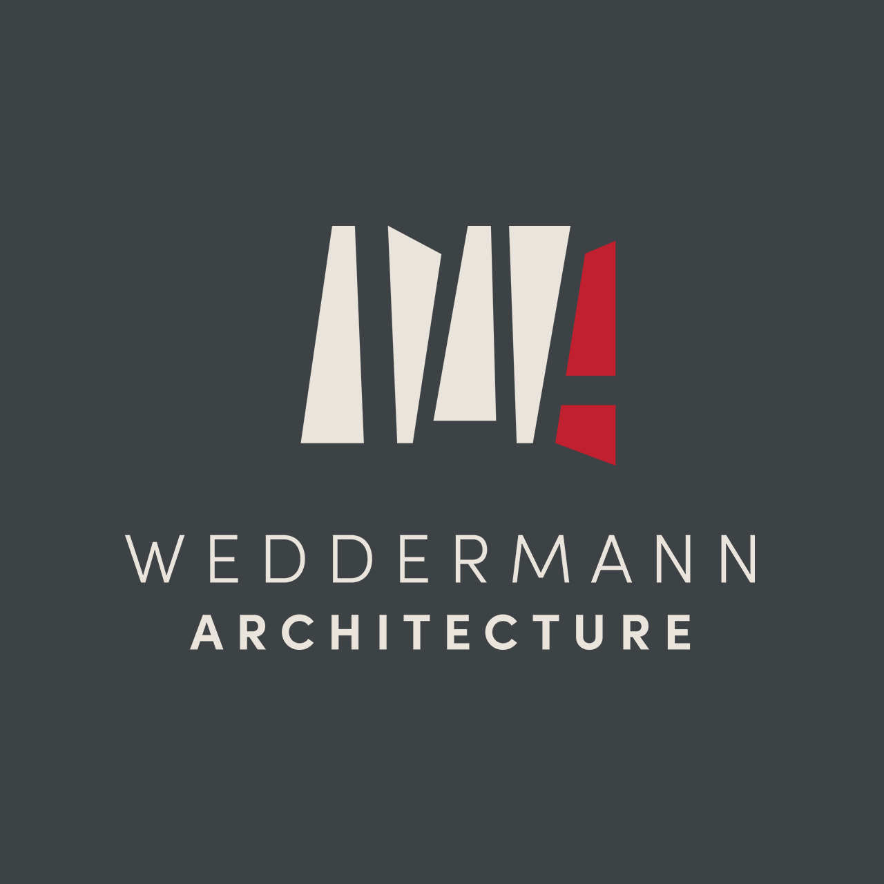
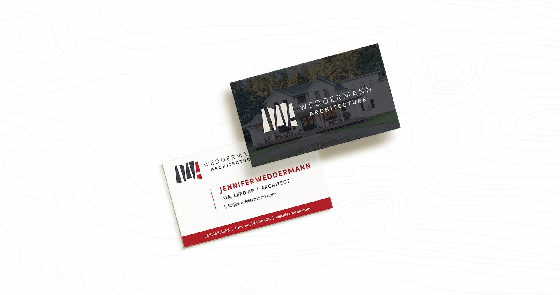
Logo
We knew how important this piece of the brand guidebook would be, especially when Weddermann’s team communicated exactly how much they planned to incorporate it throughout their entire space. Gulp. But, no pressure.
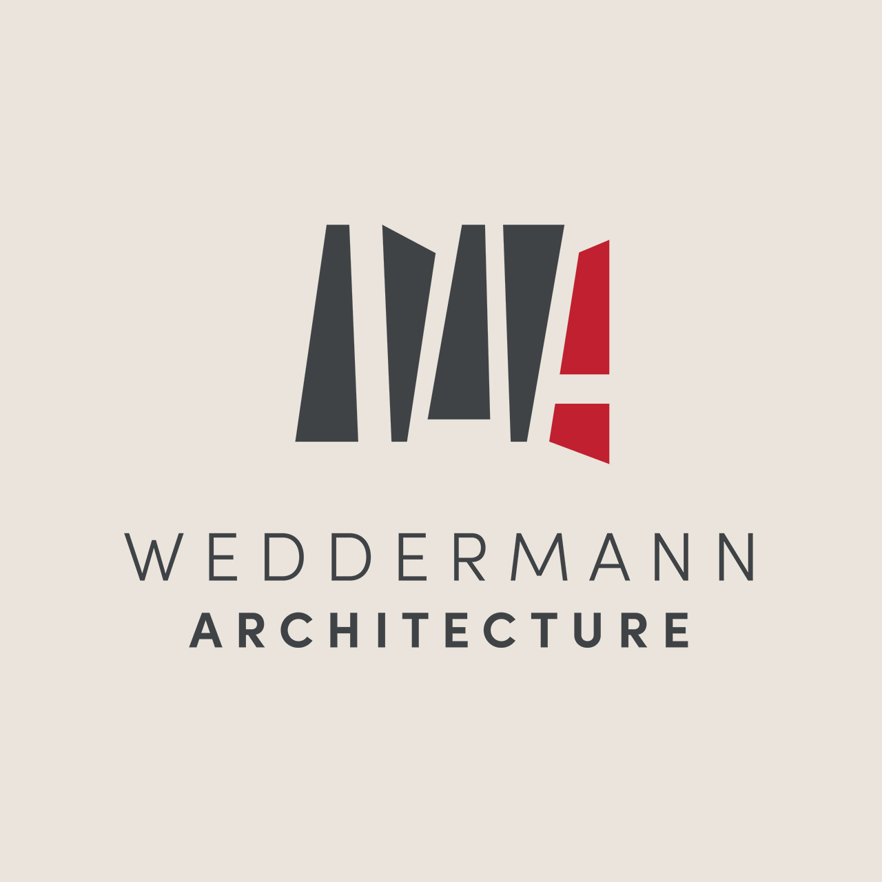
After having in-depth conversations about their vision for the logo, we learned they wanted it to have a more funky-cool and abstract feel but with straight edges rather than soft and organic.
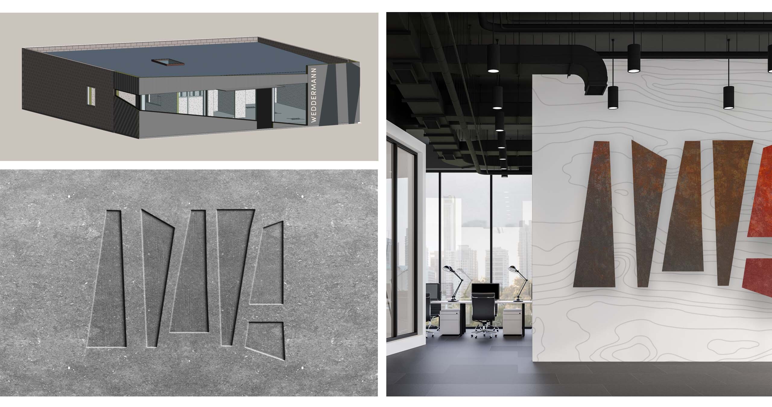
We were inspired by the unusual triangular shape of the front window in their newly renovated office and explored different ways to pull the shape into a logo. Eventually, we decided to mimic the window shape and turn it into a logo by flipping it 90 degrees and then stacking the shapes side by side to create an abstract “W” and “A” in the negative space. This was a cool way to play off shapes they already had in their office.
Because the icon was so bold, we paired it with a clean, modern font to finish the logo.
And, as we said earlier, we nailed it! The end result was beautifully tailored to their brand in a way that felt representative of who they were as designers, individually, and as a team.
The logo has caught the attention of others, and is being featured on DesignRush. More on that soon!
Color Scheme
Our designers decided to carry forward Weddermann’s signature red into the color palette. But to mix it up and add a Northwest vibe, we chose a neutral palette inspired by the materials used to bring their designs to life—such as concrete, rocks, and wood. The bold red was kept to a minimum, only popping up when an element really needed to stand out. It was a subtle change but one that made a huge difference.
Fonts
We needed to choose a font that was easily accessible to all of the team members so everyone could use it consistently across emails and documents for brand consistency through all touchpoints.
It was also important to carry the modern and clean feeling through all aspects of the brand, so we chose a sans-serif font that was not only aesthetic, but everyone in the team could easily access and use.
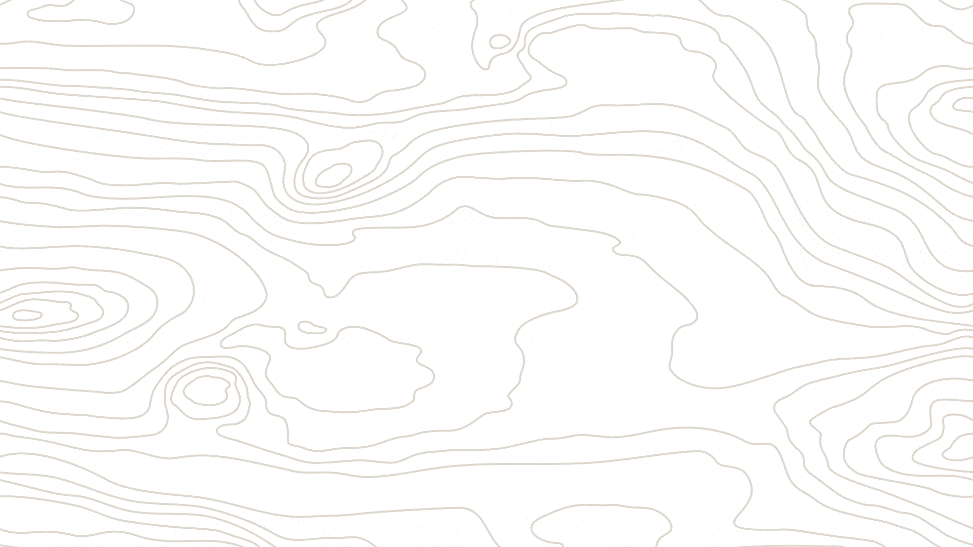
Pattern
To juxtapose natural softness with modern edginess, we chose a woodgrain pattern that could pair with any design or environmental element. The idea was to bring an interesting texture that felt fitting for their brand and balanced out the more modern aspects.
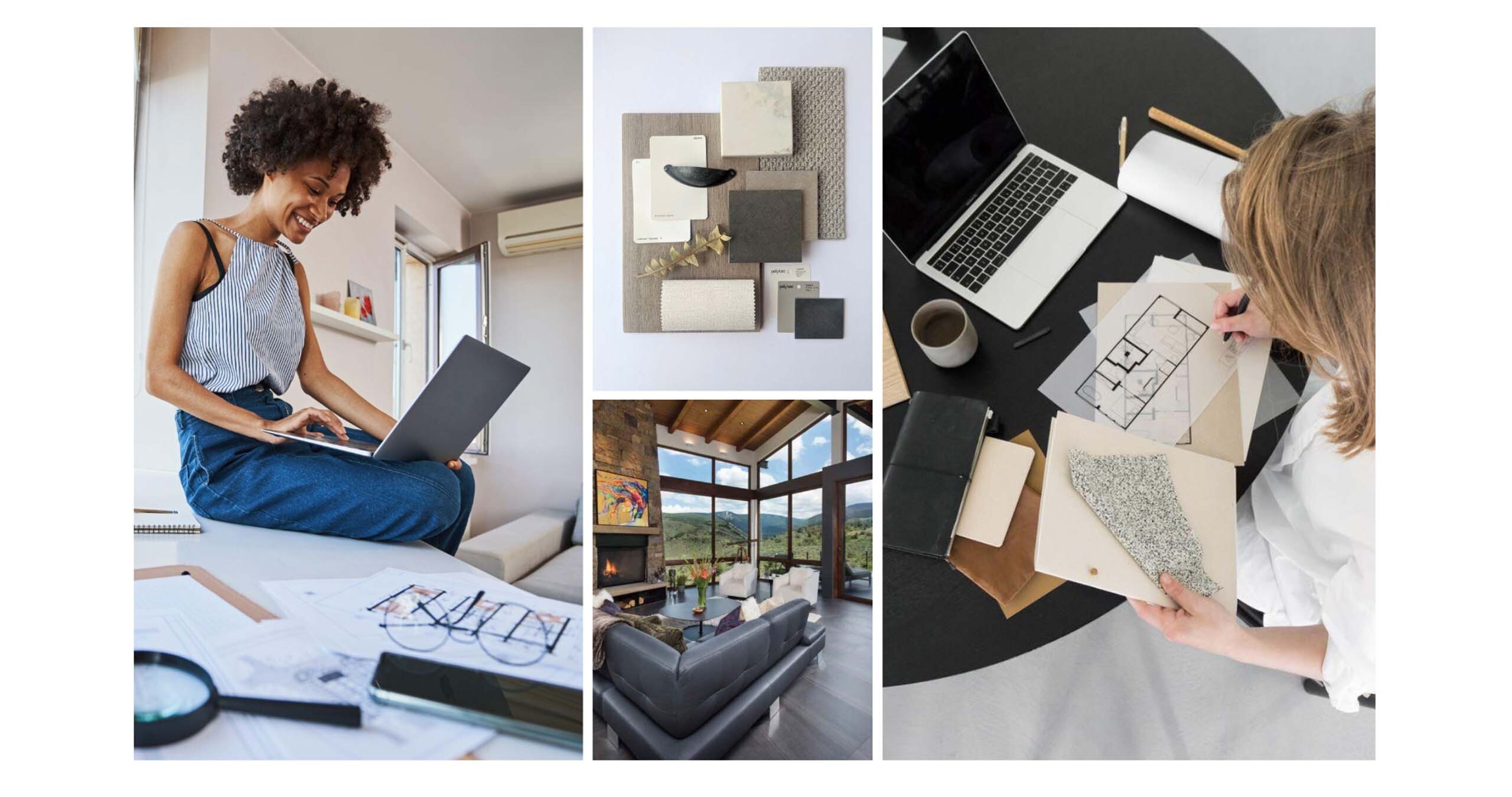
Photography
In order to give the brand a much-needed touch of warmth and life, we suggested photography based on guidelines that would include both stunning architecture and lifestyle images. Our research showed that people connect more deeply with content that features a human element, so we sought to bring that into the branding of this project.
Conclusion
Since refreshing their brand, Weddermann Architecture has begun implementing the new brand elements throughout the new space—with plans to weld the logo to the side of their building!
The messaging, logo, fonts, colors, patterns, and photography all worked together to create a cohesive brand identity that truly represented the firm’s professional and creative approach to their work and commitment to their clients and community.
We’re so proud to have created a modern, timeless, and versatile brand that gives the firm an iconic look and will serve them for years to come.